Fare Card & Token Vending Machine

KYIV METRO

The Kyiv Metro is a rapid transit system and the backbone of Kyiv’s public transportation. As of 2016, its daily ridership was 1.32 million, with an annual ridership of 484.56 million.

PROJECT ROLES

UX/UI Designer

YEAR

2015


PROJECT GOAL

Reduce checkout lines, simplify, and speed up the process of purchasing tokens and fare card rides.

CHALLENGES

The fare card has two memory slots: a monetary balance and a rides balance. Users must refill the monetary balance before purchasing rides. The fare price depends on the number of rides purchased—the more rides a user buys, the lower the fare per ride. Both memory slots have maximum limits: 200 UAH for monetary balance and 50 rides for ride balance.

Additionally, there are restrictions on the bill denominations that vending machines can validate. The devices must also be easy to install in locations with varying lighting conditions.

IMPACT

As a UX/UI designer collaborating with a multidisciplinary team, I created an application concept. Low- and high-fidelity prototypes were tested during user sessions to validate the design concept. The final version was tested on production-ready vending machine hardware.


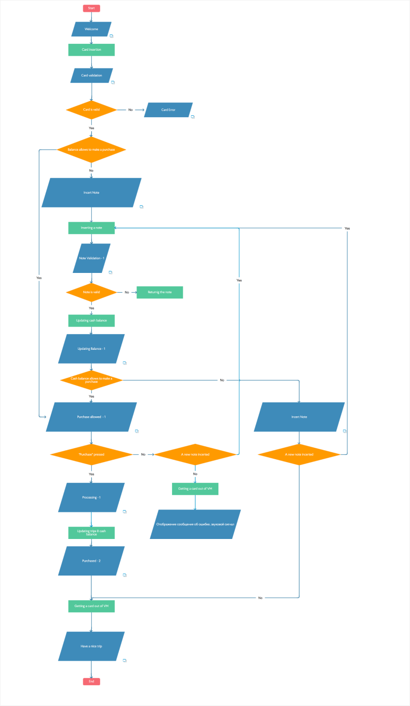
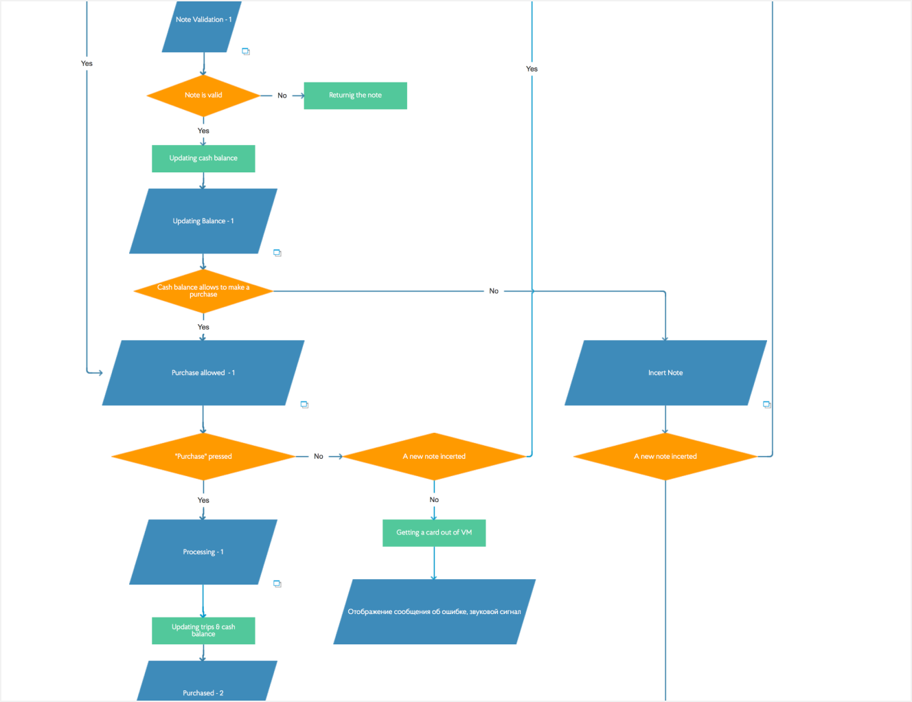
PROCESS DIAGRAM

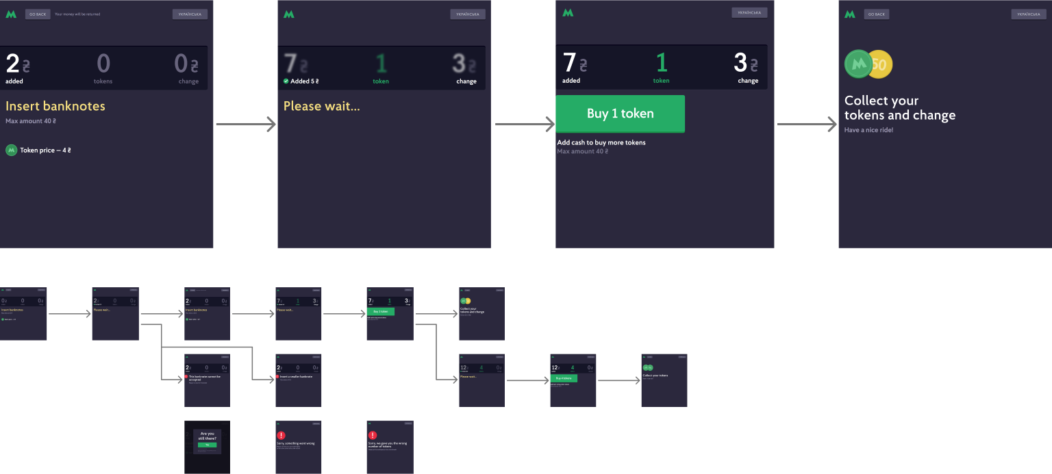
The initial process flow was defined and approved in collaboration with hardware and software developers.


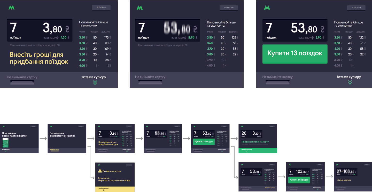
DESIGN CONCEPT OF PURCHASING RIDES USING FARE CARD

Fare card trip purchase flow: The design addressed several challenges, including limitations on accepted bill types, maximum cash balance capacity, ride purchase limits, and variable fare pricing based on the number of rides purchased. The main goal was to clearly present fare price options based on the current card balance and show the additional cash amount needed to purchase rides at a lower price.


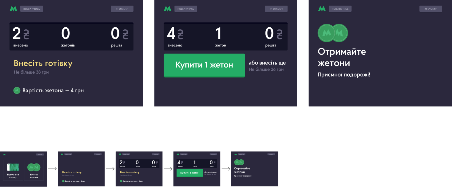
DESIGN CONCEPT OF PURCHASING TOKENS WITH CASH

Fare card trip purchase flow: The design addressed key challenges, including limitations on accepted bill types, a maximum cash deposit of 40 UAH, and a limit of 10 tokens per transaction. The main goal was to clearly communicate these restrictions to passengers, minimizing corner cases and potential confusion.


USER TESTING

Metro statistics revealed two primary fare card usage scenarios: approximately 40% of passengers insert a random bill to top up their fare card for an arbitrary number of rides—likely due to being in a hurry—while another 40% aim to purchase rides at the lowest possible fare.

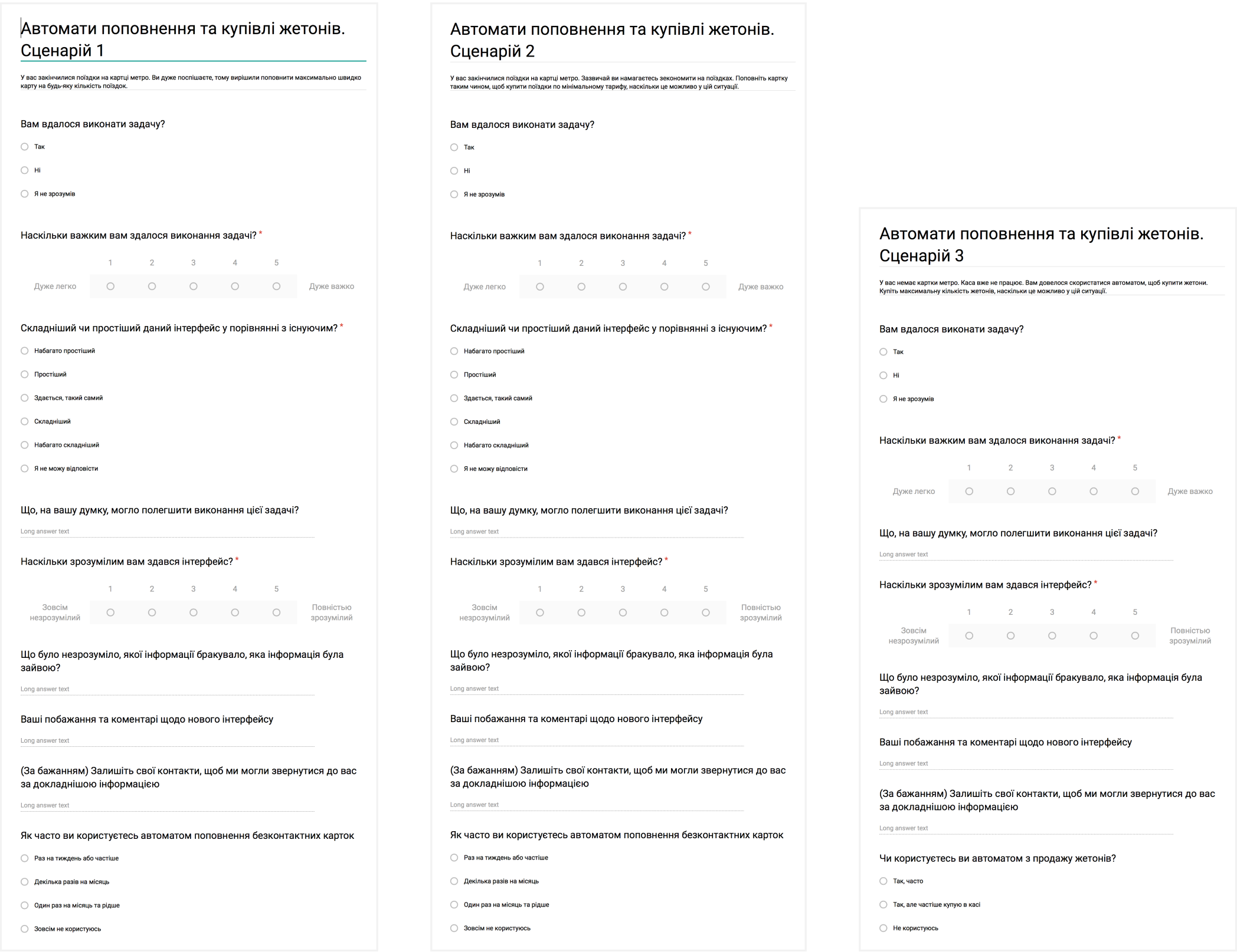
The design concept was tested against three key scenarios:
1. Purchasing a ride as quickly as possible.
2. Purchasing rides at the lowest available fare.
3. Purchasing the maximum number of tokens (the most complex scenario, as it involves multiple limitations).

The test results highlighted the strengths and weaknesses of the concept:

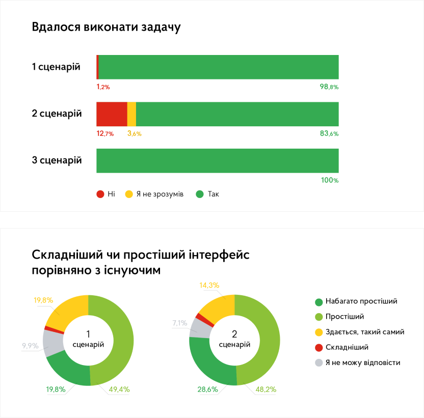
  • 98% of users successfully completed scenario #1 (purchasing a ride as quickly as possible).
  • 83% of users successfully completed scenario #2 (purchasing rides at the lowest available fare).
  • 100% of users successfully completed scenario #3 (purchasing the maximum number of tokens).

Additionally, we asked users to compare the new interface to the existing one, and the results were as follows:

Scenario 1

49.4% – it’s much easier to use
19.8% – it’s easier to use
19.8% – it’s the same
9.9% – can’t provide an answer
1.2% – it’s harder to use

Scenario 1

28.6% – it’s much easier to use
48.2% – it’s easier to use
14.3% – it’s the same
7.1% – can’t provide an answer
1.8% – it’s harder to use


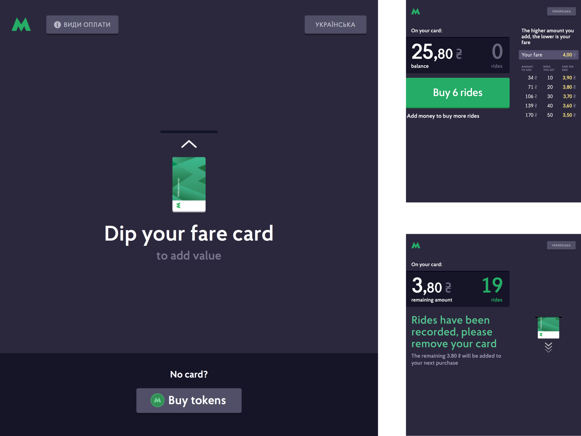
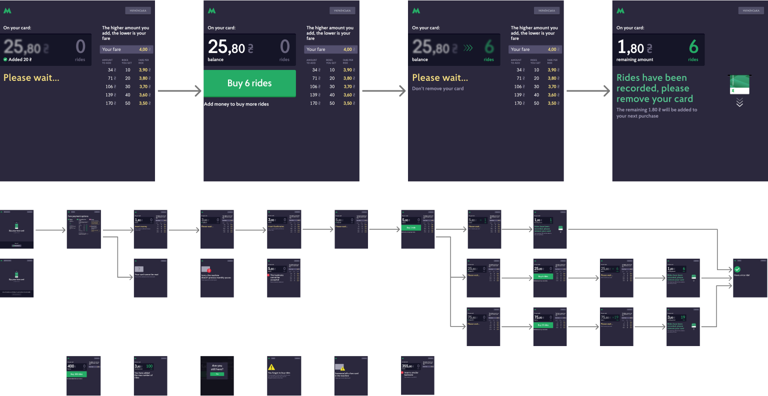
UPDATED DESIGN OF PURCHASING RIDES USING FARE CARD

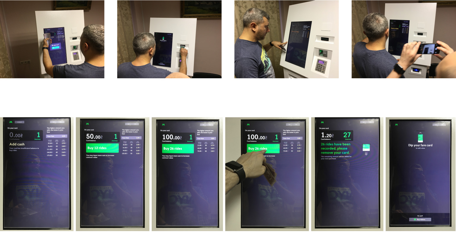
The updated design was created to meet new device requirements, including changes in screen size, aspect ratio, and bill slot placement.

Additionally, design improvements were made to enhance logical flow from a left-to-right (LTR) perspective, such as renaming ‘Cash Balance’ to ‘Rides Balance.’ Since most users familiar with fare pricing already knew the cost per ride, the table displaying ride prices was reordered to prioritize clarity: ‘Amount to add’ → ‘Rides you get’ → ‘Fare per ride.’ This allowed users to see the required additional amount first.

Edge cases were also addressed, including:
• Users withdrawing their fare card after adding money but before purchasing a ride.
• Banknotes that cannot be accepted.
• Maximum ride limit already reached.”


UPDATED DESIGN OF PURCHASING TOKENS WITH CASH

Since 100% of users successfully completed the scenario of purchasing the maximum number of tokens—the most complex token-related task—significant design changes were unnecessary in that area.

The design was updated to align with new device requirements, including changes in screen size, aspect ratio, and bill slot placement. Additionally, interfaces were added to handle edge cases such as:
• The banknote can’t be accepted.
• The banknote value is too high.


TESTING VENDING MACHINE PROTOTYPE

Testing on a production-ready device revealed the need for adjustments to colors and brightness.