Mastercard Contactless Payment in Kyiv Metro
MASTERCARD & KYIV METRO
Mastercard Inc. is an American multinational financial services corporation.
The Kyiv Metro is a rapid transit system serving as the backbone of Kyiv’s public transportation, with a daily ridership of 1.32 million and an annual ridership of 484.56 million (as of 2016)
PROJECT ROLES
Project Manager, UX/UI Designer
YEAR
2015
PROJECT GOAL
Ordinary people often have difficulty understanding the differences among payment systems and technologies. Not everyone is comfortable paying by bank card instead of cash—especially when it comes to contactless payments. Additionally, there are certain myths, stereotypes, and fears associated with contactless technology that we had to dispel. The project’s goal was to make contactless payment methods practical and convenient for everyday metro passengers.
CHALLENGE
The first challenge was the short timeline. We had about three weeks to complete planning, conduct business interviews, research all metro stations, perform two phases of user experience investigation, identify user types, conduct brainstorming sessions, design posters, and create turnstile designs. It was essential to finalize the communication strategy before the next wave of terminal installations at stations.
Another complexity was the project’s broad target audience. Metro passengers include millions of people with diverse ages, incomes, and varying levels of technical and financial literacy.
IMPACT
As a Project Manager, I led a multidisciplinary team of designers through all phases of the project. Additionally, as a UX/UI designer, I actively participated in design activities.
In 2015, following the successful implementation of the project, adoption of Mastercard’s contactless payment system significantly increased, becoming part of the everyday experience for Kyiv Metro passengers.
ARCHETYPES
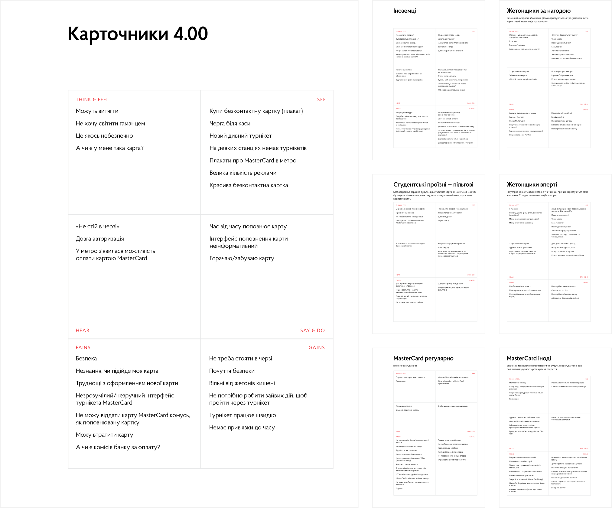
Research for this project proceeded in two directions. Firstly, it was essential to study the target audience to segment millions of passengers into several archetypes—typical roles with similar characteristics. The process began with an online survey, which allowed us to formulate initial hypotheses about motivations behind payment method choices, as well as identify common passenger needs, concerns, and stereotypes.
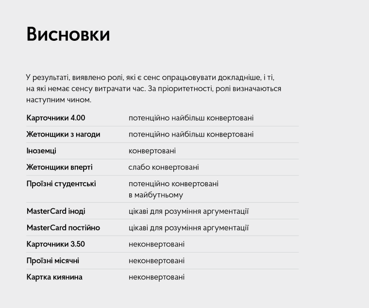
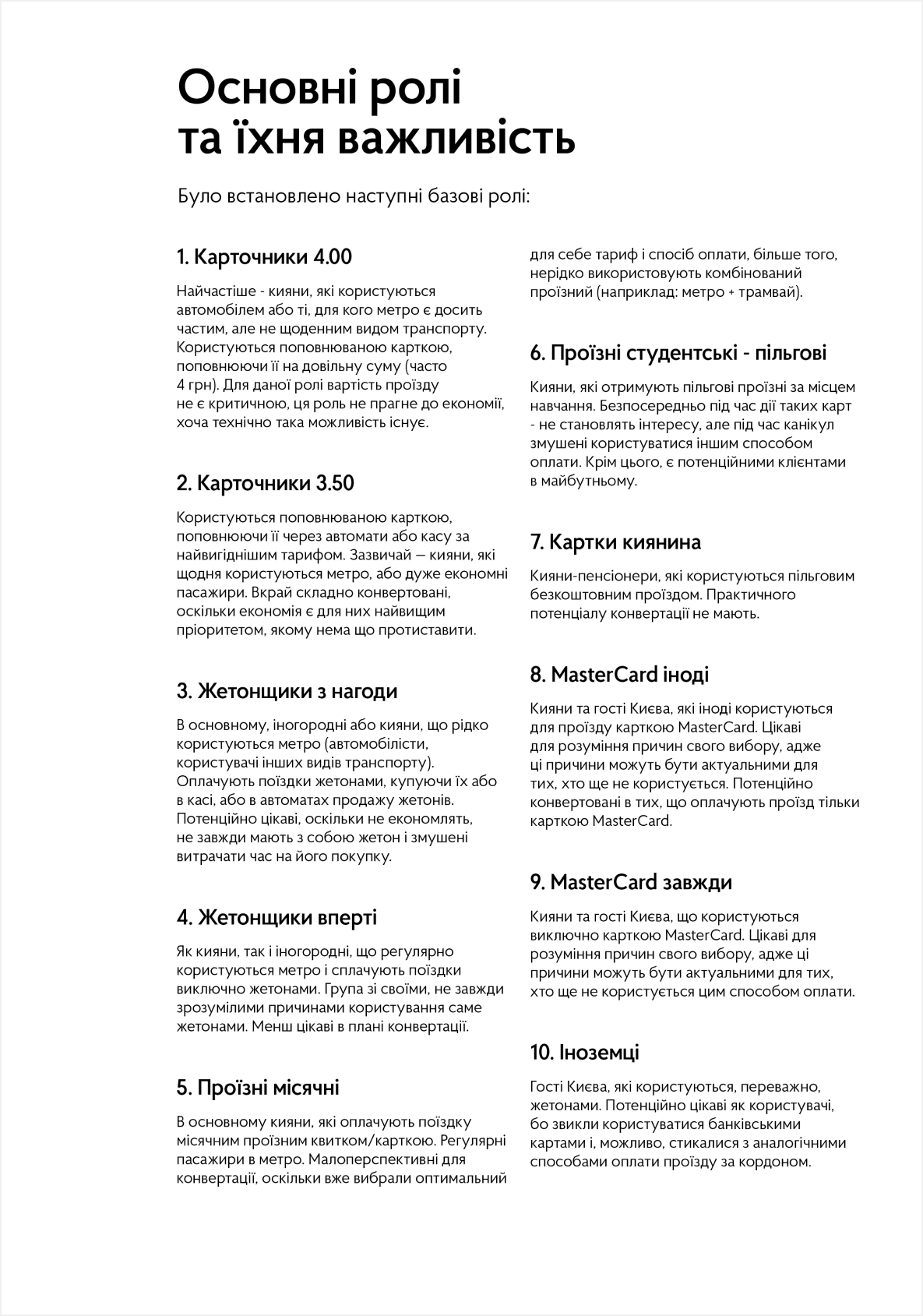
The following potential archetypes were identified:
- Fare card 4.00UAH – most promising customer
- Fare card 3.50UAH – non-convertible
- Occasional token – most promising customer
- Token only – non-convertible
- Monthly fare card – non-convertible
- Subsidized student card – potential future customer
- Kyiv resident card – non-convertible
- Occasional Mastercard – important for understanding motivation
- Mastercard only – important for understanding motivation
- Foreigner – potential customer
EMPATHY MAPS
Based on the online survey data, six archetypes were identified. By creating empathy maps using insights from the previous survey, we aimed to better understand what users think and feel, see, hear, say and do, as well as their pains and gains.
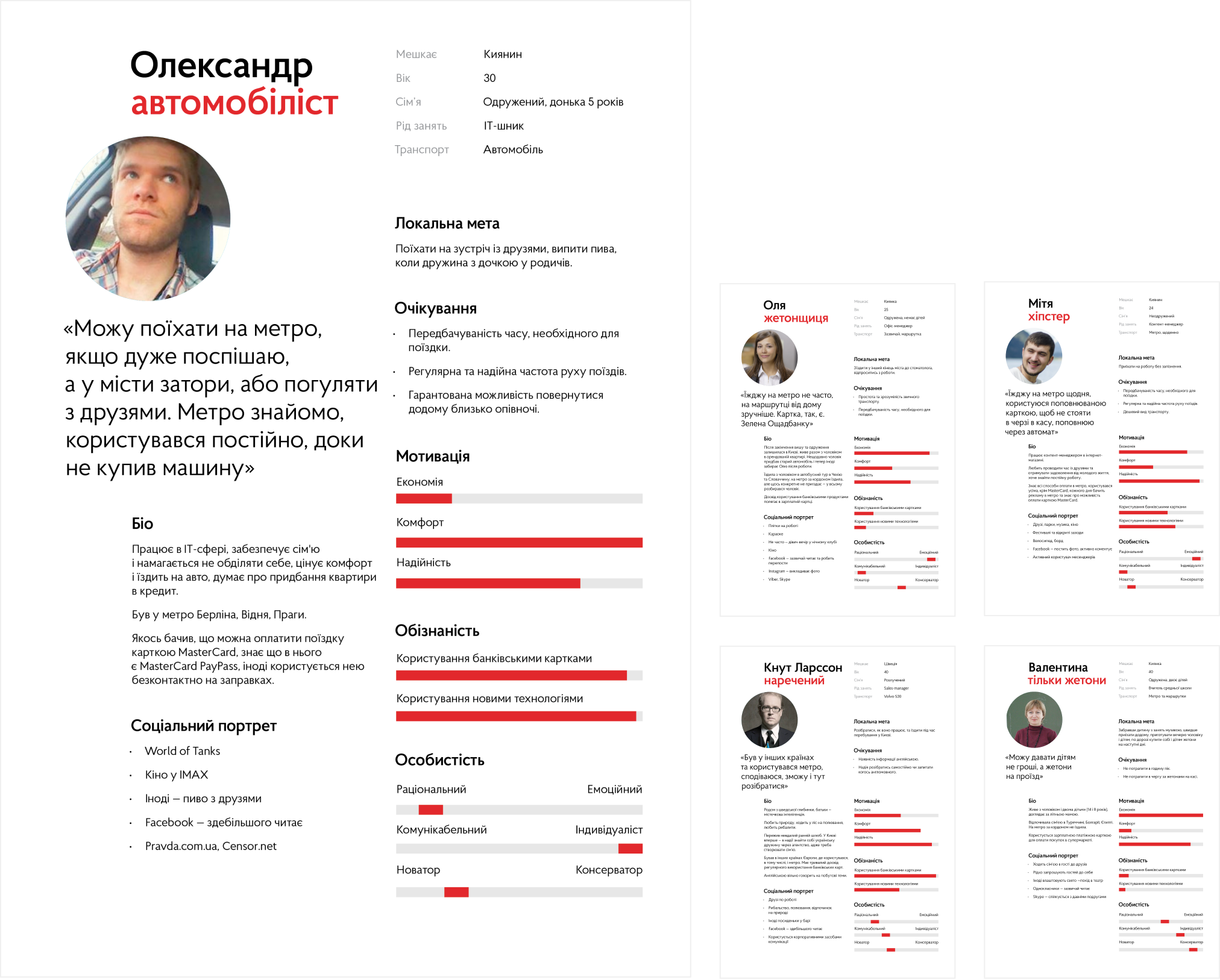
PERSONAS
Using the collected data, these archetypes were elaborated into detailed personas, each defined by their specific goals, needs, motivations, and personality attributes.
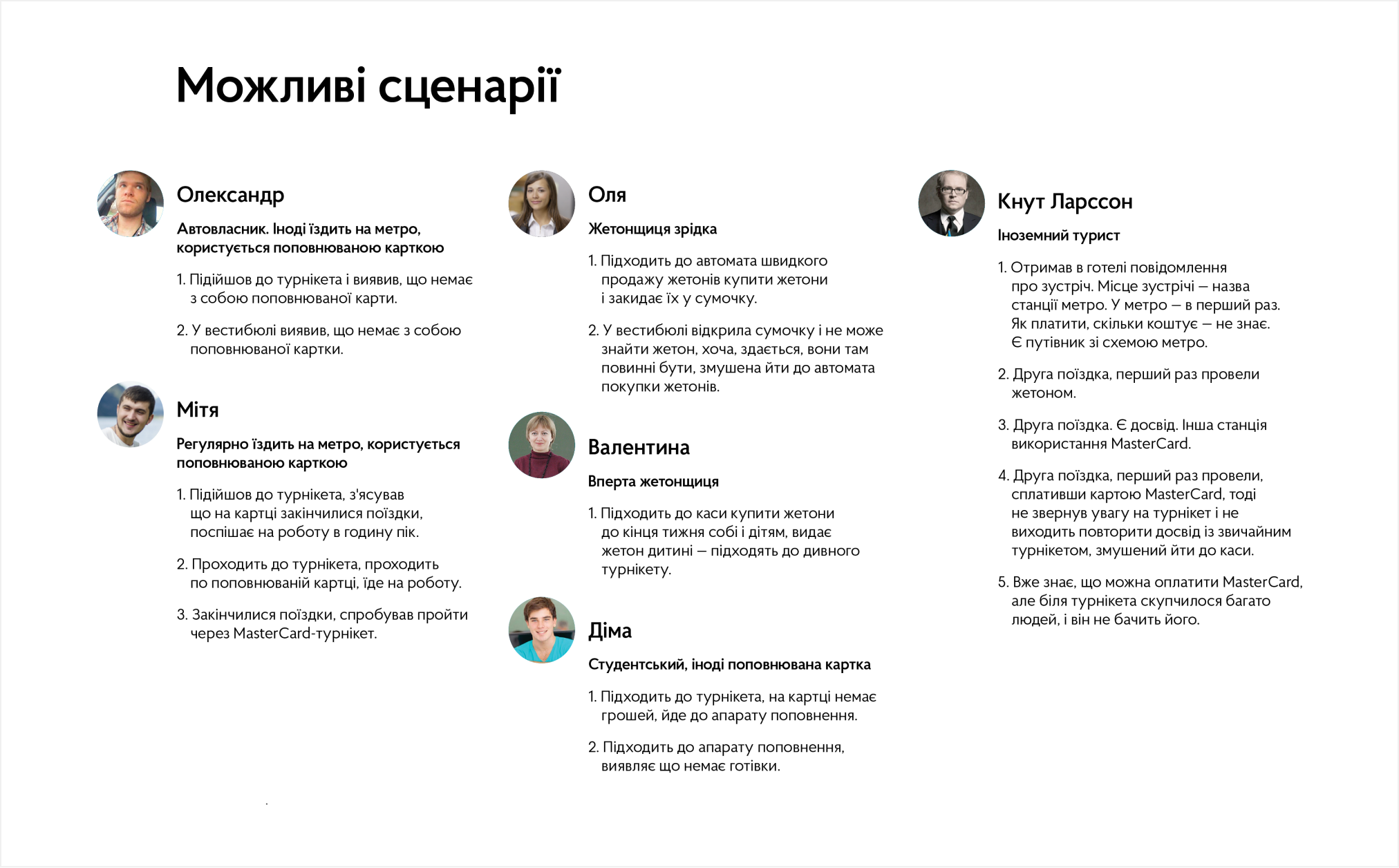
USE CASES
With these personas in mind, we defined a list of potential use cases for each persona.
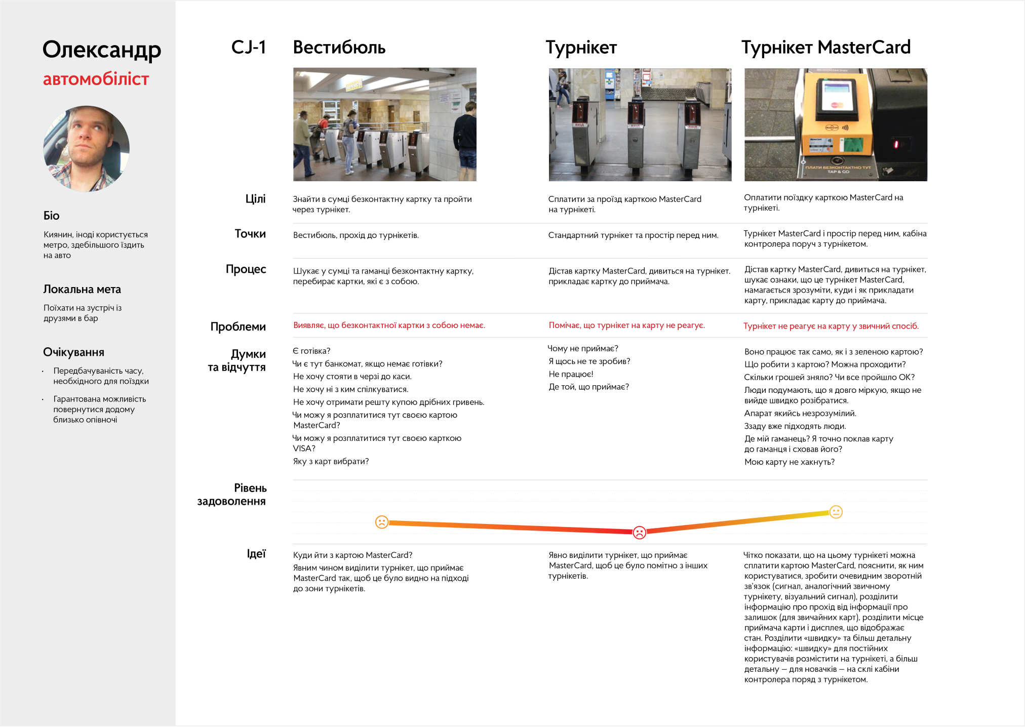
CUSTOMER JOURNEY MAPS
Use cases were described as customer journeys, detailing specific steps, goals, touchpoints, and issues encountered at each point. This approach allowed us to identify major pain points and supported the ideation of possible solutions.
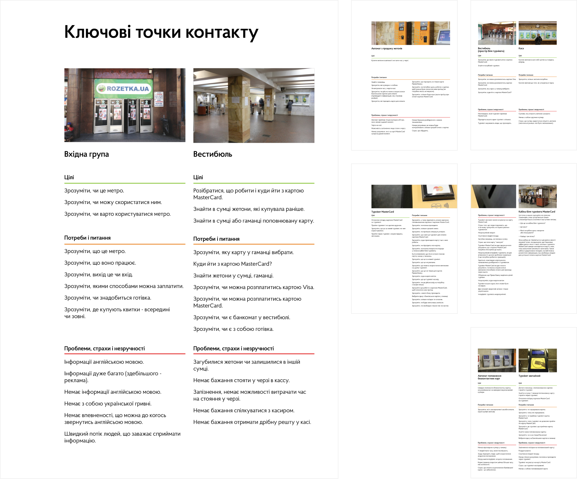
CONTACT POINTS DISCOVERY
To better understand the issues passengers may face at specific touchpoints, we conducted research by visiting and photographing touchpoints at every metro station. The goal was to define passenger goals, needs, and pain points from a touchpoint perspective. Further analysis of the collected images allowed us to identify similarities and differences among touchpoints and classify them accordingly.
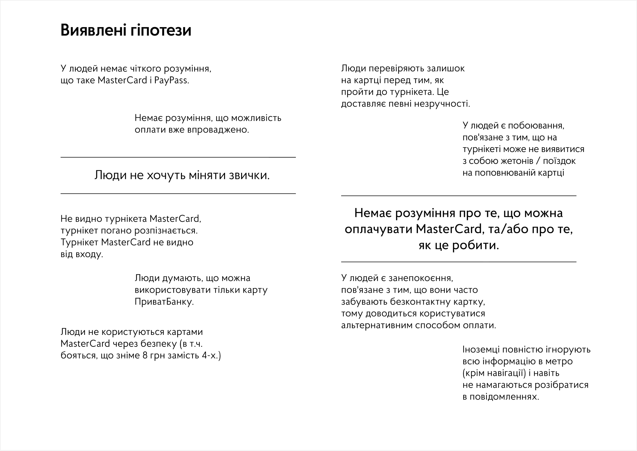
HYPOTHESES
Based on data from the online survey and discovery phase, we formulated a set of hypotheses.
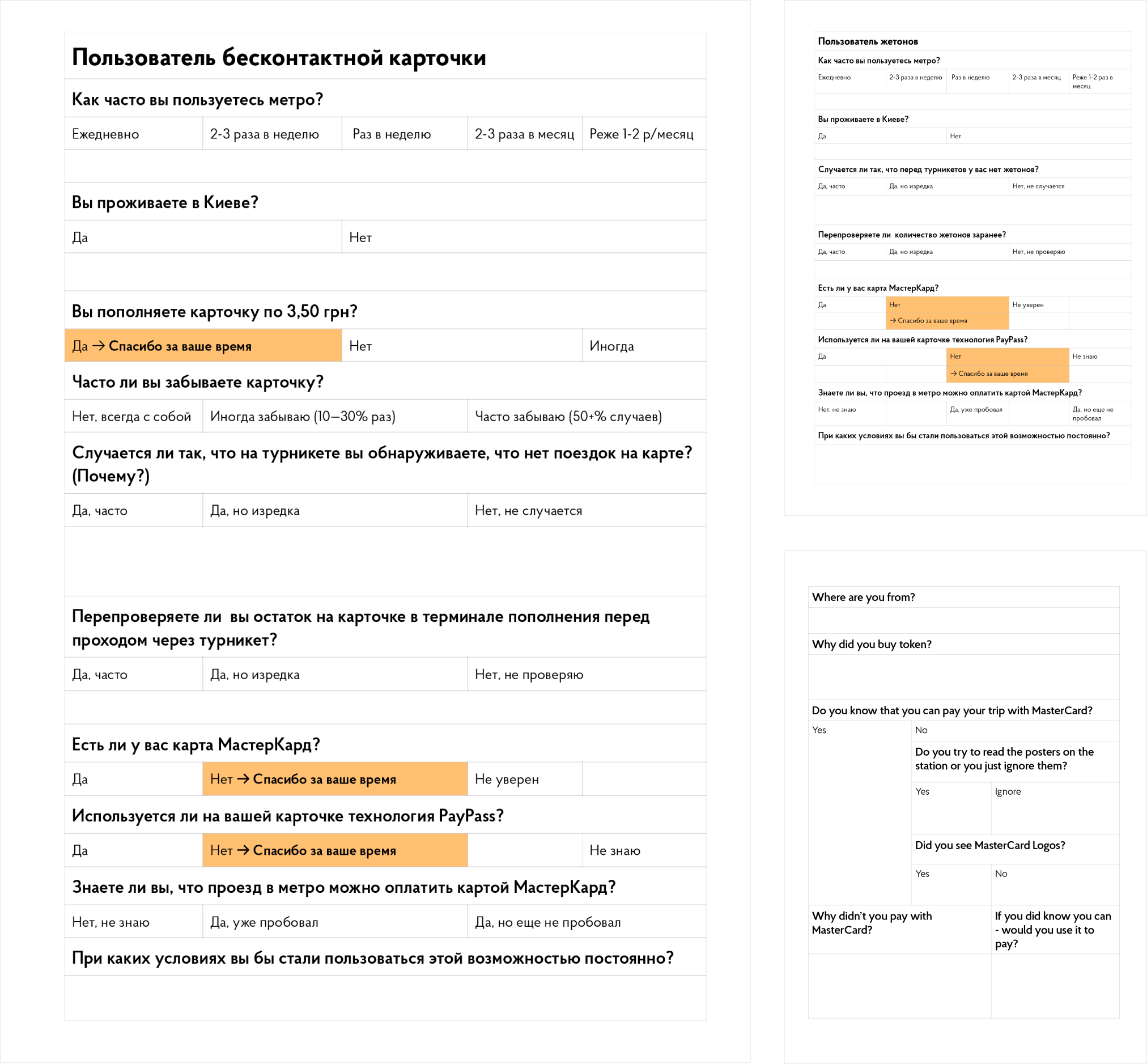
SURVEY QUESTIONARY
While these were only initial hypotheses that needed validation, refinement, and clarification, we developed a survey tailored to each role and conducted in-person interviews with real passengers in the context of their payment process. Recognizing that some archetypes had extremely low potential for changing their habits—such as passengers purchasing rides at the lowest possible price and those without banking cards—we defined ‘markers’—specific questions designed to identify these archetypes early in the process and discontinue their interviews.
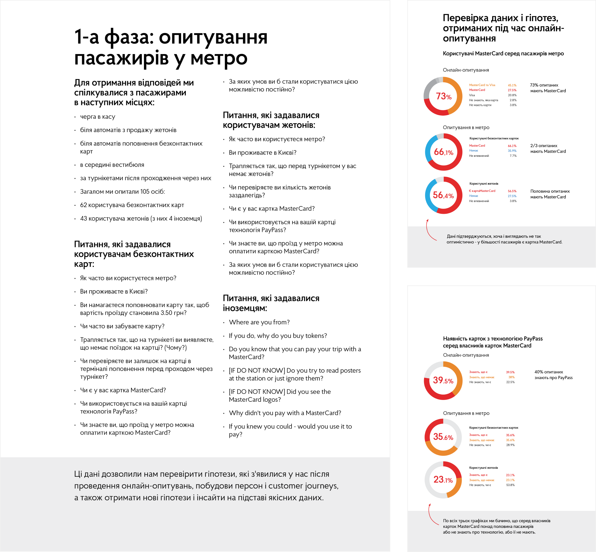
SURVEY STAGE 1. INTERVIEWING PASSENGERS
The results of this research provided valuable insights. It confirmed the hypothesis that the majority of passengers own Mastercard-type cards and are aware of the new contactless payment option. However, it also revealed that their understanding of this payment method and payment systems in general needs improvement. Some respondents lacked a clear understanding of what Mastercard is, often confusing it with Visa or assuming it was issued by a specific bank. The most challenging task for passengers was determining whether their card supported contactless payments.
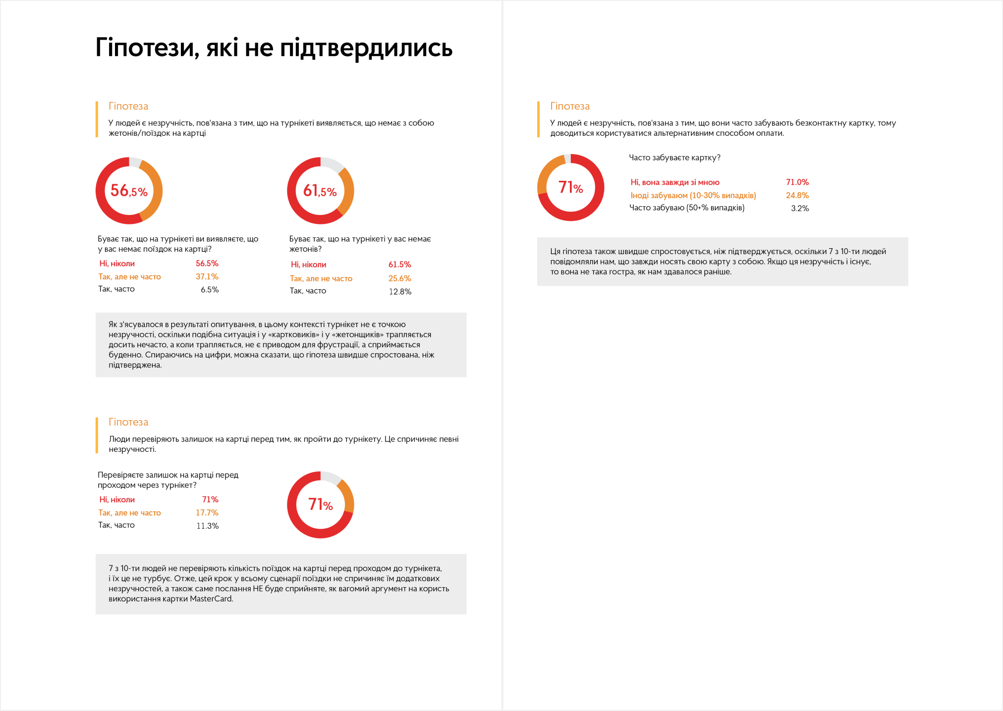
HYPOTHESES THAT FAILED
The survey results provided a deeper understanding of users’ needs, revealing that some of our initial hypotheses were incorrect. We initially assumed that passengers would be frustrated if they realized they had no tokens or prepaid fare card rides right in front of a turnstile or that they regularly checked their fare card balance before reaching the turnstiles. Addressing this was one of the key pain points we aimed to resolve through design.
However, according to the survey results, only 6.5% of respondents occasionally faced this issue, while only 3.2% occasionally forgot their fare cards at home. Additionally, just 11.3% of respondents actively monitored the number of rides left on their fare cards. The majority of passengers surveyed indicated that even when they encountered these issues, they did not find them particularly frustrating.
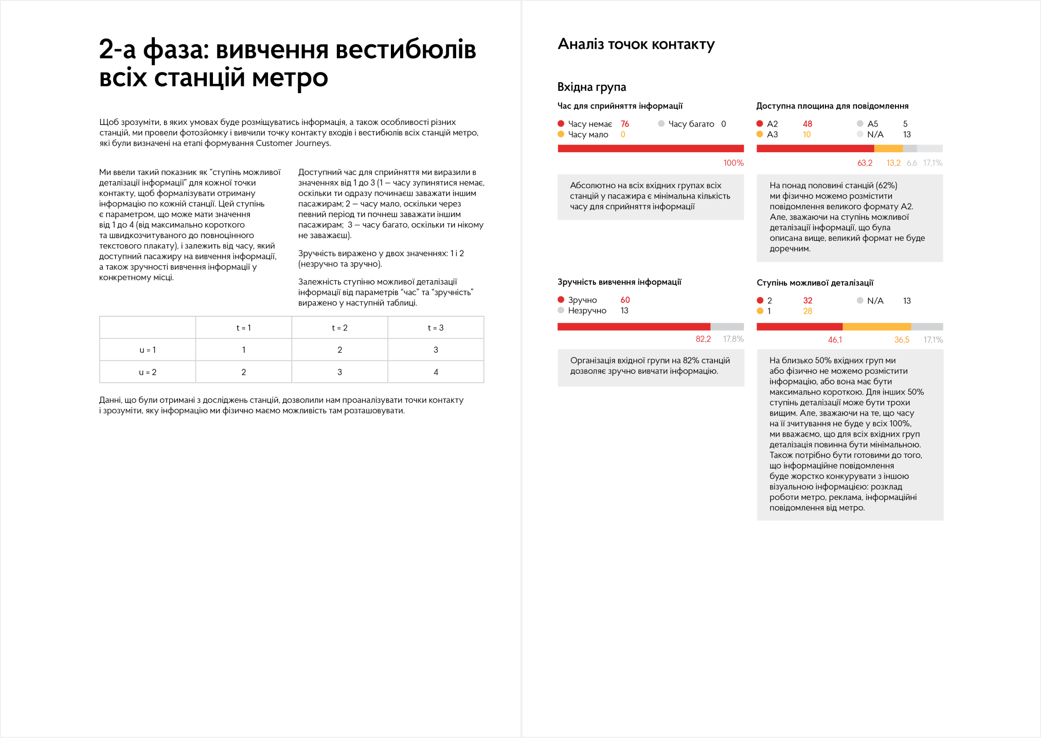
SURVEY STAGE 2. STUDYING THE LOBBIES
During the second stage of the survey, we studied the lobbies of all subway stations to understand their differences. We photographed 73 lobbies across 52 stations to determine where and what type of information could be placed. Additionally, we analyzed all the contact points identified in the customer journeys for each station.
To systematize the data, we introduced an index of ‘the reasonable level of information detail’ appropriate for each contact point. This index was based on how easily information could be discovered and the amount of time passengers had to process it at each point. The index ranged from ‘1’ to ‘4’:
1 – Minimal information that passengers can perceive almost ‘on the run’ or from a large distance.
4 – Detailed information that passengers can read from a close distance with sufficient time for comprehension.
POSTERS DESIGN
Based on the survey results, we decided not to emphasize the benefits of Mastercard’s contactless payment system but instead to address passengers’ needs by providing the most essential information about this payment method in the subway:
- You can now pay your fare directly with your bank card.
- Which cards support this feature.
- Where and how to pay with the card.
- The fare amount and whether there are any additional fees.
- Whether the card needs to be activated beforehand.
- Who to contact for questions or issues.
Posters that focused on addressing user needs rather than promoting a brand or feature aligned with one of our initial project constraints: our design should not be perceived as an advertisement.
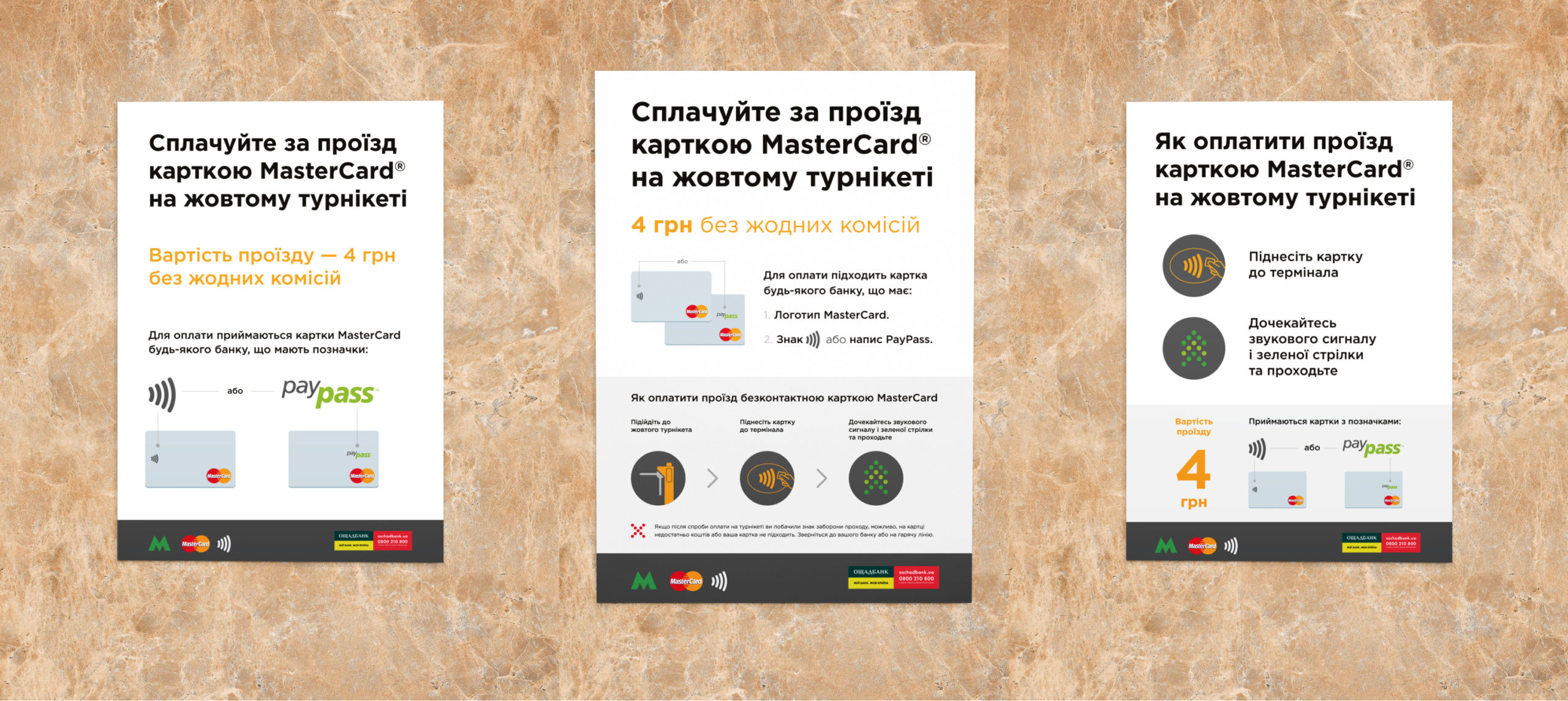
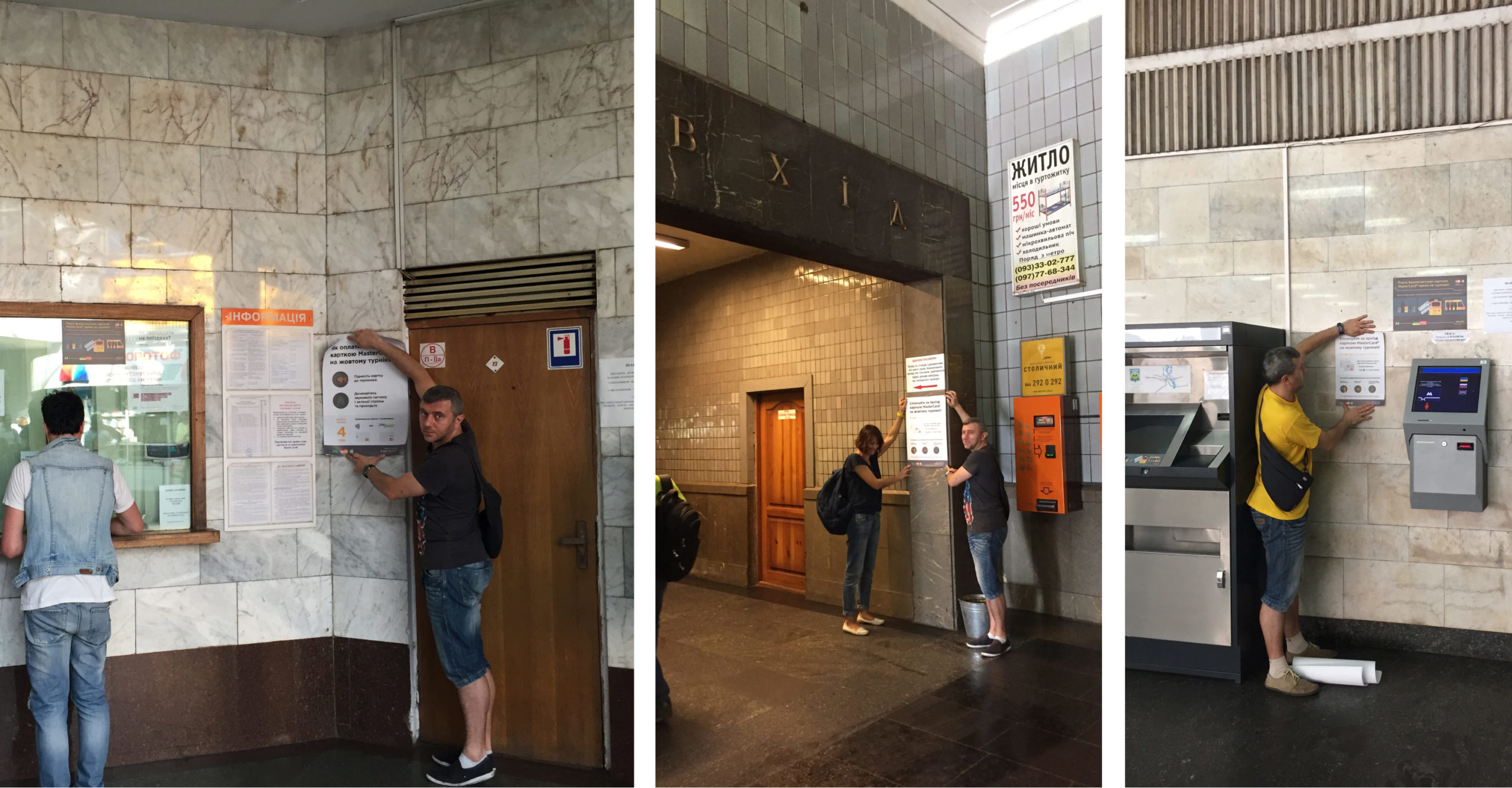
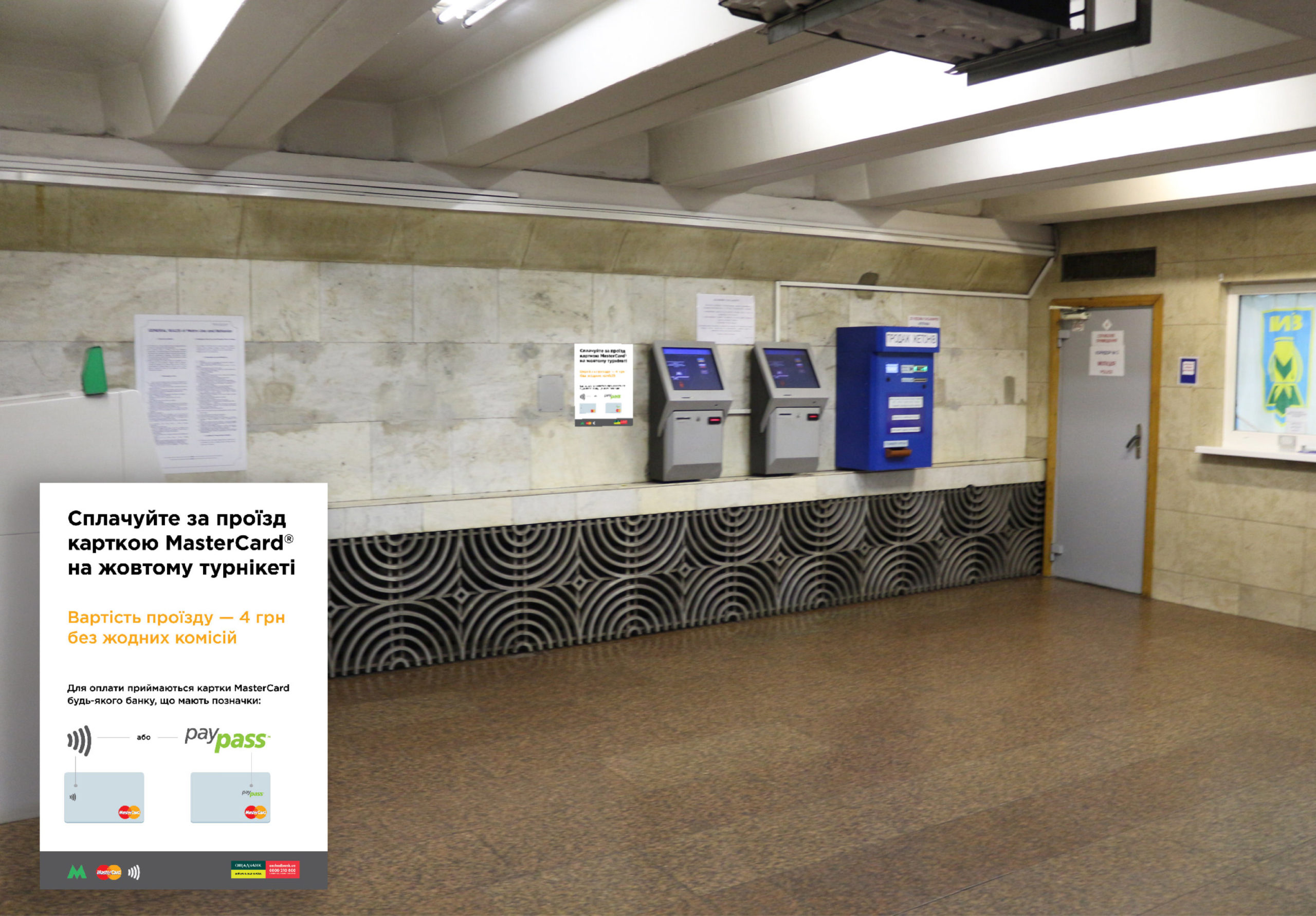
The ‘Informational Poster’ (on the left) simply informs passengers about the option to pay with a Mastercard contactless card. It is placed in locations where passengers are unlikely to linger or where information is difficult to process. Examples of such locations include ticket desks and fare card refill machines in crowded or narrow lobbies.
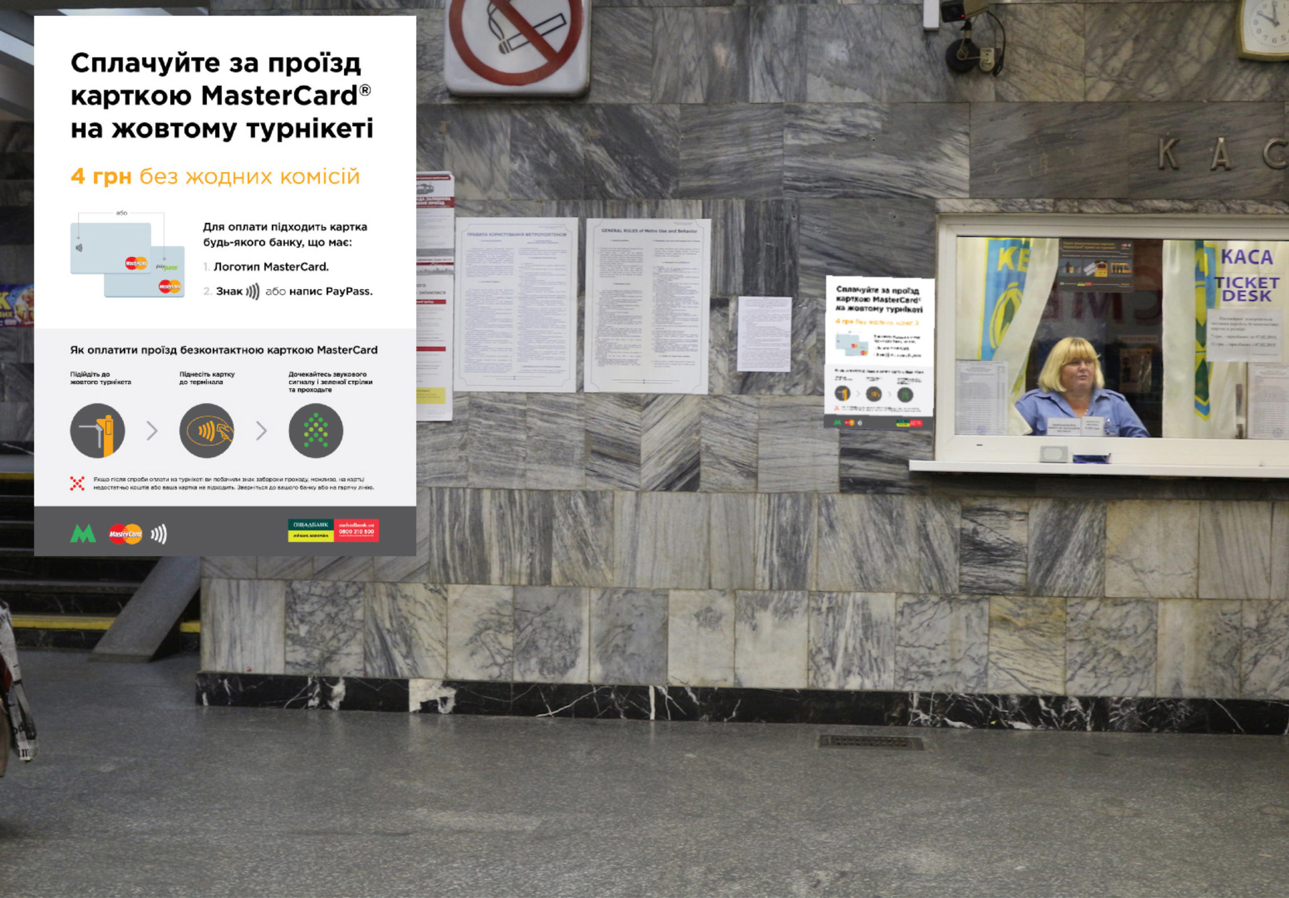
The ‘Educational Poster’ (in the middle) contains the most detailed information. It is placed in locations where passengers can stop and read the content safely.
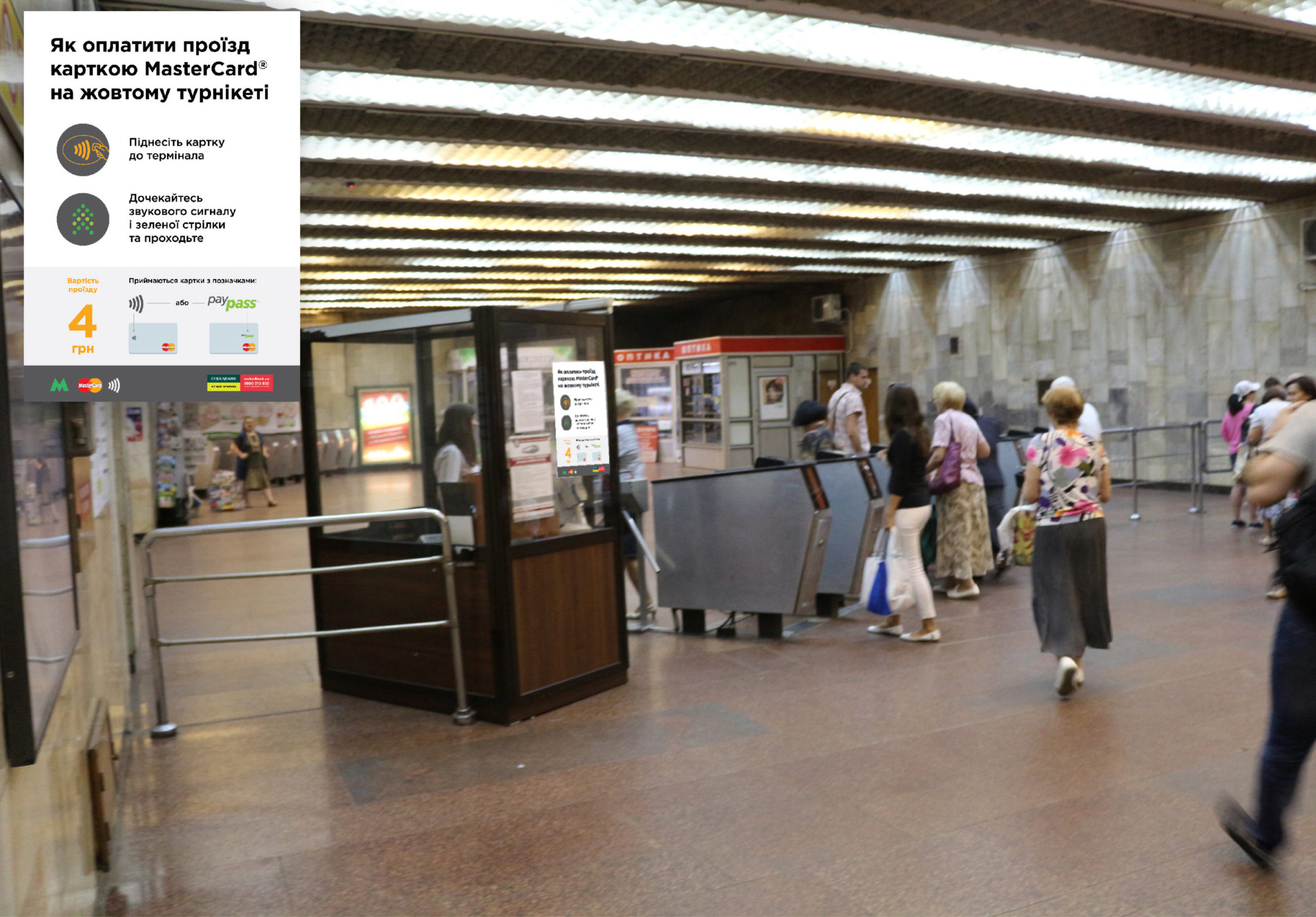
The ‘Guiding Poster’ (on the right) instructs passengers on how to use a Mastercard contactless card in the subway. It is placed on the controller’s booth near the turnstiles.
TESTING POSTER DESIGNS
The designs were tested in real conditions to assess their visibility under different lighting conditions. This helped in making further recommendations for optimal placement.
THE NEXT CHALLENGE
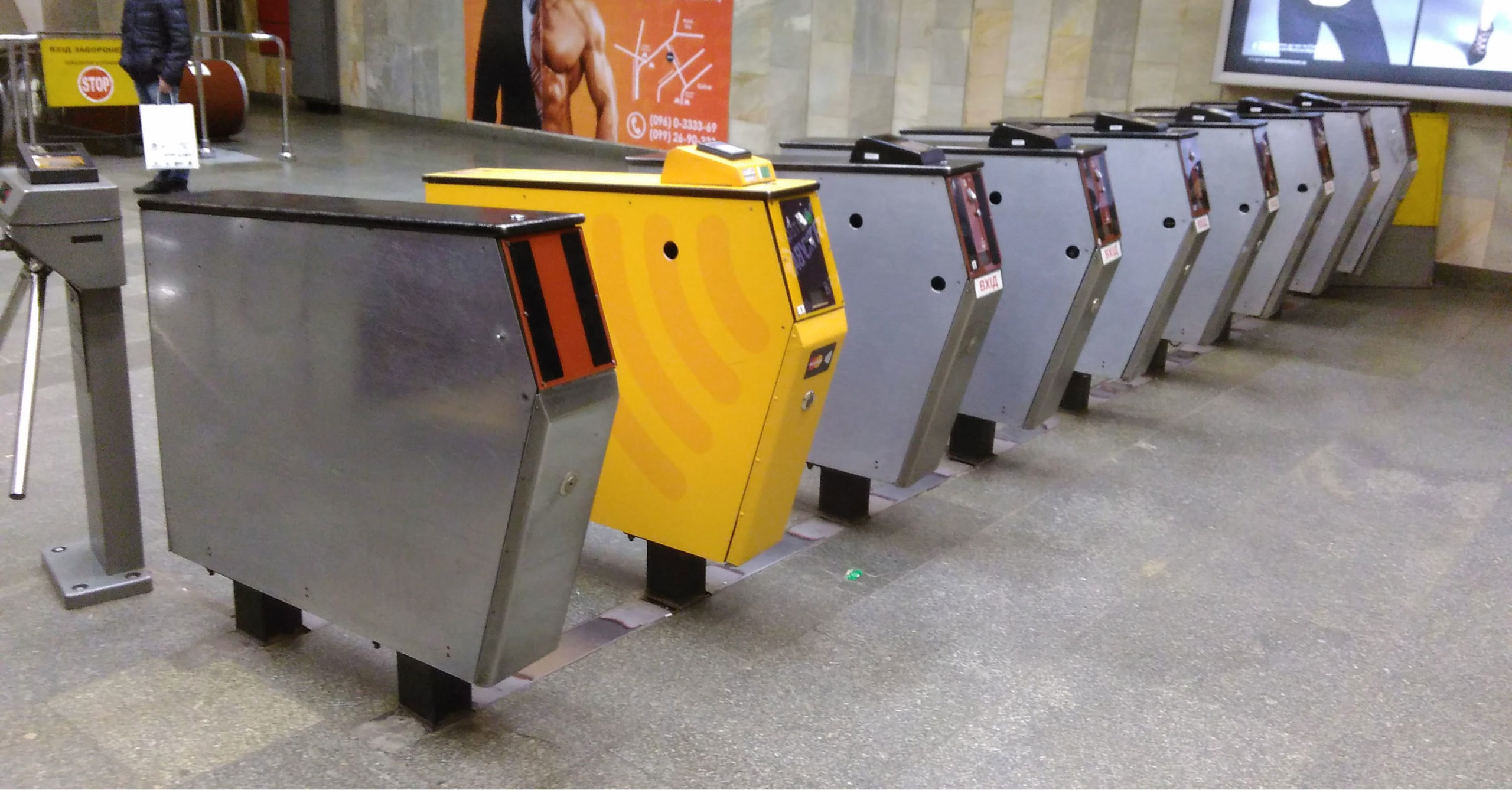
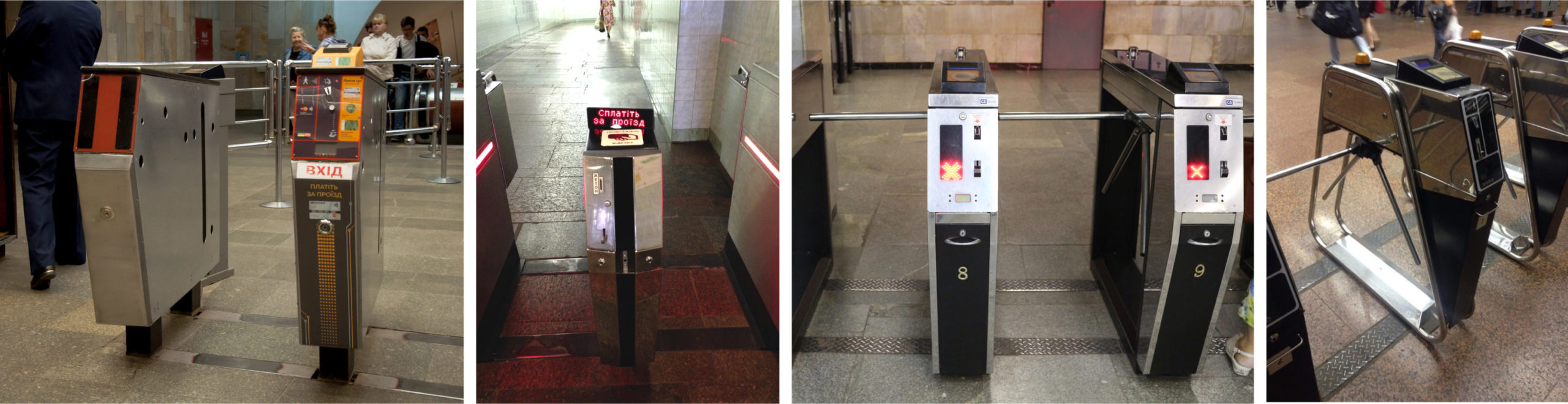
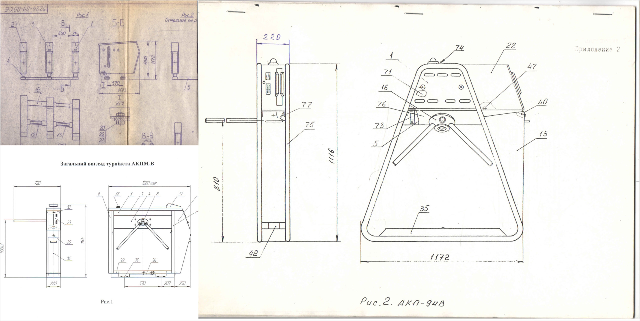
While designing the posters, we faced another challenge—the turnstiles themselves. It was difficult to communicate to passengers that they could use their Mastercard cards for contactless payments at specific turnstiles without a clear way to distinguish them. The problem was that the turnstiles were completely different from each other — there were four distinct types.
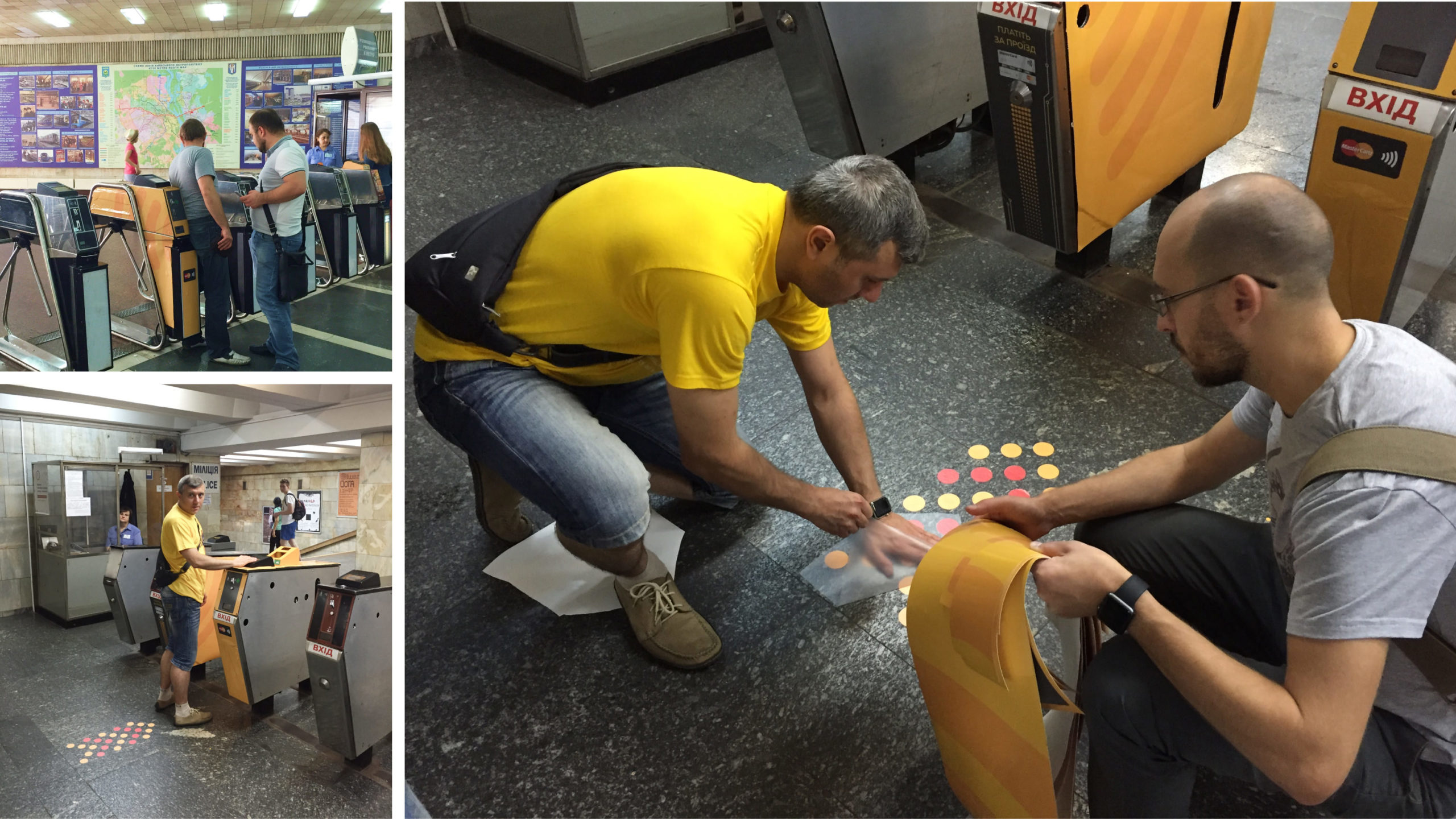
ANOTHER CHALLENGE
We needed to identify a unique feature that could distinguish contactless turnstiles. It had to be an unused element, easy to implement across different turnstile designs, and instantly recognizable to passengers—simple, clear, and ideally described in a single word. And we found the word.
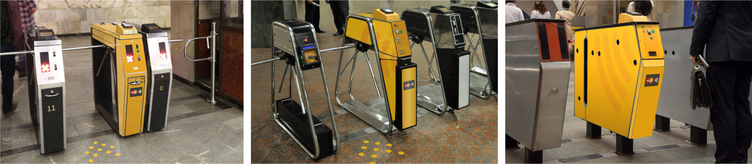
IT'S 'YELLOW'
With ‘yellow’ as the defining concept, we eliminated euphemistic and ambiguous language that could confuse passengers. Now, both posters and controllers could direct passengers to the correct turnstile using a single, clear word.
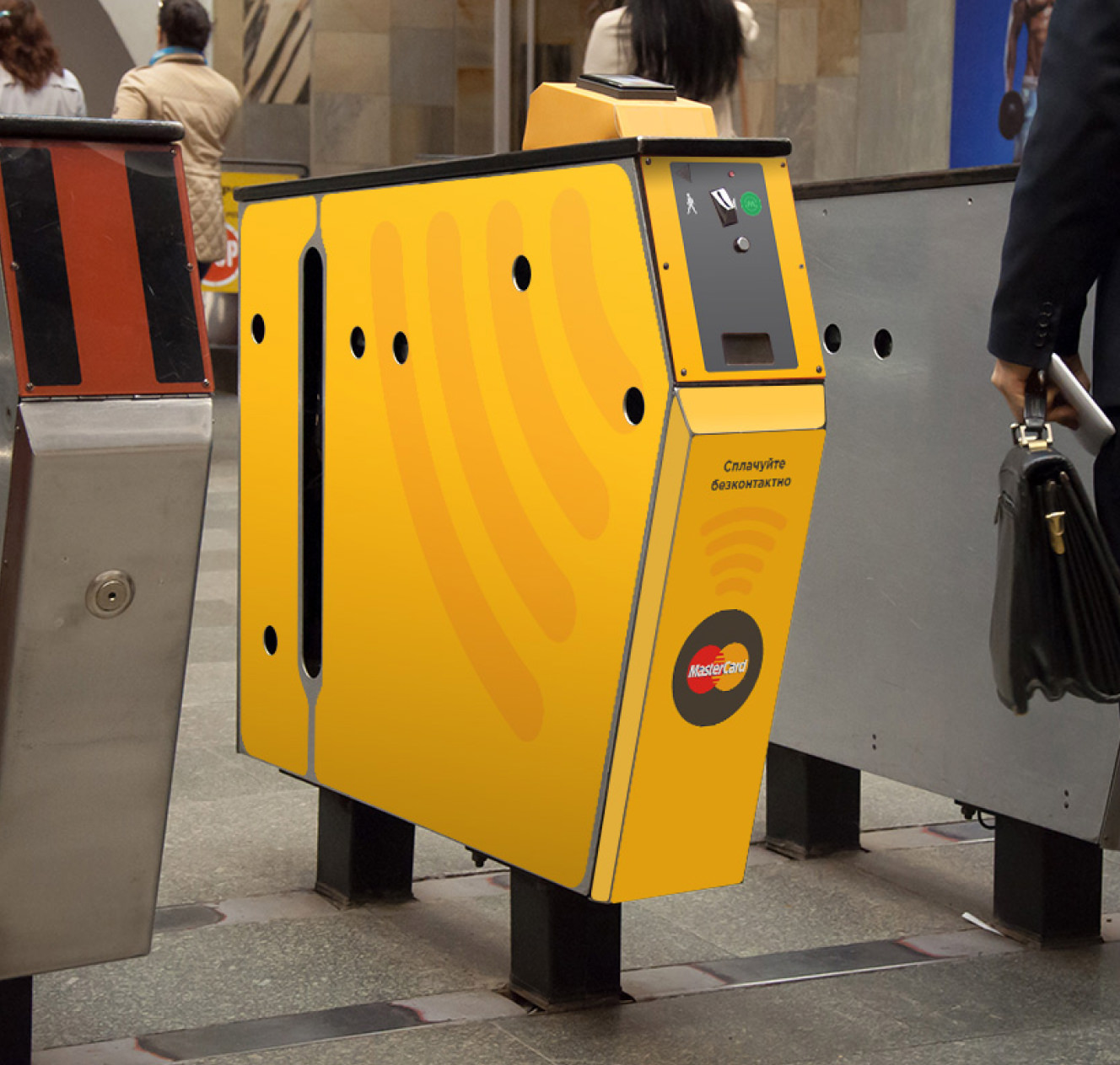
Surprising both Mastercard and the Metro with this seemingly obvious idea, we designed the visual identity of the ‘yellow’ turnstile. Since we also needed to accommodate passengers using other payment methods, we developed a design that displayed payment information for tokens and contactless metro cards, which the turnstile also accepts.
TESTING TURNSTILE DESIGNS
While testing the new design on real turnstiles, we noticed that passengers often struggled to identify which turnstile accepted contactless payments due to heavy foot traffic.
To improve visibility, we decided to paint the wall of the adjacent turnstile yellow as well, creating a ‘yellow corridor’ to clearly indicate which side of the payment kiosk passengers should use. Additionally, red and yellow Mastercard roundels were incorporated as arrow-like markers to further highlight the correct turnstile placement.
THE FINAL POSTER DESIGN
The "Informational Poster" with a placement recommendations.
THE FINAL POSTER DESIGN
The "Educational Poster" with a placement recommendations.
THE FINAL POSTER DESIGN
The "Guiding Poster" with a placement recommendations.
THE 'YELLOW' TURNSTILE
Over time, the roundels on the floor wore out, but they were no longer needed—passengers had become well aware of which turnstile allowed contactless payments.