Articles
Designing better UX for subway token vending machine
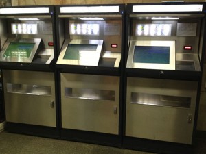
The Kyiv subway administration has added new token vending machines at some stations. It would seem that it is designed to make the process of buying tokens faster and easier, however, I’ve found most people stand in line in an “old school” way, buying tokens from a human operator while the machines stand idle with passengers paying merely no interest to their existence. What is wrong with them?
THE TOKEN VENDING MACHINE FRUSTRATION
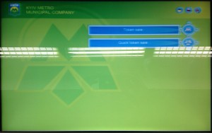
The machine welcomes passengers with two options available: “Token sale” or “Quick token sale”. What's the difference? Which of those options is right for you? There’s no explanation given.
Looking at the screen you may find that UI doesn’t look like something you can interact with as there are no UI elements that would look like buttons and I’ve seen people walking away with choosing none of them. By tapping the screen I found that a rectangular with a text works as a button.
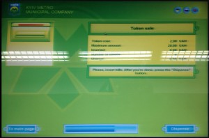
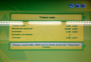
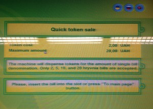
Both “Quick token sale” and “Token sale” gives you quite similarly looking screens, providing no clear understanding of their difference. Trying to insert a 1 Hrn into the machine ended with a failure with no reason given. It just returns it. One bill after another. Using a changing machine makes no difference – it rejects every 1 Hrn bill. By looking at the screen you will find a bill acceptor that doesn’t look like a real one. If there was an idea of making it skeuomorphic – why is it located on the opposite side? The progress bar you can see at the bottom of the screen is a timer. Icons at the top allow switching between three languages. I've found that switching into English doesn't allow me to switch back to Ukrainian or Russian. While it isn't challenging for me, it may become a problem for those who don’t speak English. The icons itself… Have a look at the screen size. Is there any problem with making these icons full size labeled buttons? I could describe all the other failures of trying to buy a token in detail, but I’d rather save your time.
TOKEN VENDING MACHINE ALGORITHM
Experiments have helped me to figure out that the vending machine has two algorithms – the first one allows you to insert a bill, click a button to get tokens and change, and the second - inserting a bill, clicking a button to get tokens and change. А user could switch the machine to the quick mode to get tokens based on a bill denomination or to the regular mode to insert one or multiple bills one after another to get tokens. The quick mode doesn’t accept 1 Hrn bills as it’s less than one token (1 token = 2 Hrn), but it accepts 2 Hrn, 5 Hrn (for 2 tokens and 1 Hrn change), 10 Hrn and 20 Hrn bills. The normal mode allows you to add bills (1,2,5,10 or 20 Hrn) one after another then tap dispense to get tokens and change. Additionally, none of the modes allows you to choose a token amount you might want to buy and there is no way of inserting a 20 Hrn bill to get 2 or 4 or any other amount of tokens and change. Inserting 20 Hrn means you will get 10 tokens anyway.
NORMAL MODE ALGORITHM
1. User taps “Token sale”
2. User inserts a bill
3.1. User taps “Dispense” to get tokens & change
-OR-
3.2. User inserts another bill
3.2.1. User taps “Dispense” to get tokens & change
4. Machine dispenses tokens
QUICK MODE ALGORITHM
1. User taps “Quick token sale”
2. User inserts a bill (only one bill allowed)
3. Machine dispenses tokens or tokens & change
The only actual difference is that in the first case the machine accepts 1 Hrn bills and waits for the next bill, in the other it will not. The reason is as simple as this – token vending machine engineers tried to design an algorithm of selling tokens with no human just mechanics in mind.
MAKING THE WORLD BETTER
Assuming the knowledge given by experiments, we have two scenarios:
- buying tokens without change (2, 10, 20 hrn bills)
- buying tokens giving change (1, 5 hrn bills)
It’s clear that we have a 3-to-2 chance of having a case that doesn't require a change. It makes the algorithm not only more clear but unifies it and gets rid of an unnecessary step – choosing a mode.
THE UPDATED TOKEN VENDING MACHINE UX DESIGN
BUYING TOKENS WITH A CHANGE SCENARIO
1. User inserts a bill
2. Machine dispenses tokens and provides ability to add another bill or to get change
3.1. User taps “Get change”
-OR-
3.2. User inserts another bill
4. Machine dispenses tokens or tokens & change
BUYING TOKENS WITH NO CHANGE SCENARIO
1. User inserts a bill
2. Machine dispenses tokens
The updated UX provides the user with the ability to interact with the machine with a single tap in the case of “buying with change” scenario while buying with no change needs no taps. All one has to do is insert a bill and get their tokens. There would then be three screen templates instead of all that mess that we can see now. Here are screen design sketches:
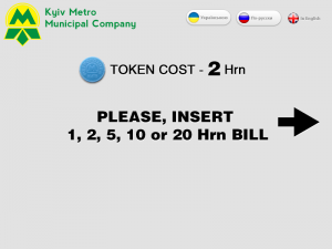 1. The welcome screen displaying a token price and 1, 2, 5, 10, 20 bill nominations that are acceptable, as there still are 50, 100, 200 and 500 Hrn bills that don’t work so this note would be useful. You can also find that the arrow is pointing to a bill acceptor.
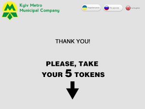 2. “Thank you” screen – in case of no-change scenario shows a total of tokens purchased with an arrow pointing to the tray.
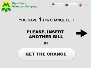 3. “Insert another bill or press Get change” – in case of change scenario.
The approach doesn’t affect tokens counting in case of charge scenario as it will show you the final “Thank you” screen with a total of tokens purchased. The present token purchase algorithm restricts the max amount of tokens that can be purchased to 10. An updated version makes this restriction irrelevant as if a user needs to get more tokens – he can insert bills one after another without a need of starting a purchase process again. From the perspective of interaction with the screen UI, the updated design requires no clicks at all (or just 1 click if you’ll end with a change scenario).
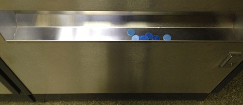
The last but not least: have a look at the tray – an open compartment where you would find your tokens. It can be hard to grab them with one movement as you may need to slide them right or left to the corner to get them out. Leaving all the speculations about its size aside (we are not in a casino, right?), why not curve it down in the center so all the tokens would slither to the center and it would be much easier to take them out.
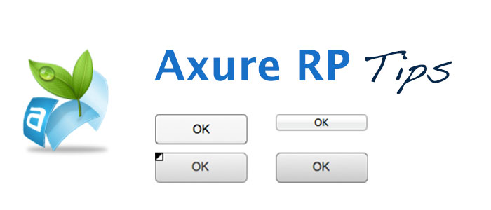
Button vs button shape : Axure RP prototyping tips
The button is an essential part of any interface. Sure there are exotic button-less UIs, but in most cases, users are looking for “the Button”. In this post I’ll share some button tips & tricks you can use prototyping in Axure RP.
Two types of buttons
In Axure RP among others, you can find these three widgets: Rectangle, Button Shape, Button. Note that Rectangle and Button Shape by their options & behavior are identical, the only difference is that you’ll see it as “Unlabeled (Button Shape)” or “Unlabeled (Image)” in your list of widgets. Sure, you are pretty familiar with the best practices and use to always name your widgets properly. For the rest, it’s a little dirty hint to use Button Shape if you are lazy enough.
Button Shape vs Button
By its origin Button uses our OS UI to render it as well as to deal with. That means:
- system standard height
- system standard style
- system standard behavior on mouse-over, click, etc.
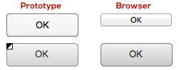
On the opposite, Button Shape is a custom widget that provide us with more options and control over its behavior. It’s possible to use custom colors and shapes, as well as OnMouseEnter and OnMouseOut actions.
| Button | Button Shape | |
|---|---|---|
| Shape | OS standard | Customizable |
| Height | OS standard | Customizable |
| Button Color | OS standard | Customizable |
| Font Style | Customizable | Customizable |
| Rollover Style | OS standard | Customizable |
| Mouse Down Style | OS standard | Customizable |
| Selected Style | OS standard | Customizable |
| Disabled Style | OS standard | Customizable |
| ToolTip | Available | Available |
| OnClick Action | Yes | Yes |
| OnMouseEnter Action | Depends on OS | Customizable |
| OnMouseOut Action | Depends on OS | Customizable |
So, use Button if you need it to look “system” and Button Shape (or Rectangle) if you need control and customization. Be sure to test you Button look in different OS browsers as its look will vary.
Custom button with icon
There’s one issue you can come across dealing with a button: you can’t insert an icon into it. While you can just place an icon over your button, it will mean two options you’ll loose with – your button loses its rollover style while mouse cursor is over the icon, and it’s not clickable.
While you can set OnClick action for your icon laying over the button the same as the button action itself, you will not find a Rollover state among “Set Widget(s) to Selected State” actions. Well, there’s a little trick you can use to eliminate that and make your custom icon-labeled button fully functional. Note: use this trick only if you don’t need to have a separate selected button state (ex. by pressing a button user will be transferred to a different page or screen).
As we have only two given button states (Default and Selected) we can use the latest one to mimic the rollover button state while the mouse is over an icon. To set that we need to add OnMouseEnter case for our button icon, choose Set Widget(s) to Selected State and set the button’s value as Selected. In order not to stick with the selected state after your mouse runs over the icon, add the opposite (set button’s value as Default) OnMouseOut. Now, open Edit Button Shape right-click menu and set the same style for both Rollover Style and Selected Style. That’s it – you have a custom button with an icon embedded with a natural rollover & click behavior for both icon and button itself. Note, there is a way to make it quicker: instead of setting actions for button and icon, you can set those actions to an Image Map Region and place it over your button and icon altogether. Acting that way you’ll avoid setting OnClick actions for button and icon and setting OnMouseOver/Out settings for your icon, but it will add one more layer object to your prototype and you will not be able to set MouseDown Style.
Now, when you’re done with a nice custom button, one more dirty trick: if you spent some time designing our compound UI element, have set all its actions and need another one with a similar look and behavior, don’t hesitate to copy it. You will find that your button+icon+image map region copy will work as a separate instance. However, remember that we do follow best practices so, please, set an appropriate name for your new widget.
Defining Your Website Target Audience Needs
Previously, we defined secondary website development objectives based on the possibilities of the site as a tool. This article focuses on your site visitors, for whom we are planning the site design, information, and functionality.
In determining the secondary objective, we addressed the site’s effective use for the company’s narrow practical interests: reducing costs for routine operations and improving communications. Those methods gradually focused on needs of the website’s future visitors; this is critical because the company must focus on its customers.
We are omitting the definition of the target audience itself. To develop a site for your existing business, you need a clear idea of your potential client’s profile. If you are planning a new business, you need to define your target audience. We will assume the target audience of your future site is known to you, so we will focus on ways to identify target audience needs in the site’s context.
While being familiar enough with your future target audience, it is necessary to account for two factors:
1. Your target audience’s actual needs may be different from your understanding of them
2. Your target audience may not understand their own needs, which may well present an ideal opportunity for your business
To a great extent, our perceptions depend on our knowledge of a specific area. One’s education, profession, and activities all help develop these different knowledge levels and can create a multitude of perceptions. We all live in an overlapping but the simultaneously different world and therein lies the trap. In your particular business, you have different information and perceptions than your target audience.
In developing the site for a wide audience, your perception is different from the perception of those for whom this website is to be designed (we will not address the website made for a specific group of specialists). You are not your site target audience. To a certain extent, you are the antipode.
Since we plan to develop the site for the target audience, we must clearly define the needs of its visitors and help create the understanding mentioned above. Those needs can either be conscious or unconscious.
Conscious Needs
Conscious needs are simple: what is the visitors’ interest in your site and why will they use it. In the beginning, we mentioned the prime of the motive in your action. Now we need to determine the motives of the main participants: the site visitors.
You may know most of your target audience’s needs quite well and be able to readily articulate them in a short list. It is logical to continually supplement and adjust this list: as your business “insider”, you have a different view on the subject than the target audience. How do you generate this list?
Users’ search engine queries analysis is the effective tool for collecting generalized information. You should not be afraid of the jargon; this is simply a list of words and phrases used to find data in search engines ranked by popularity. By using this tool, you can get an idea about the interests and priorities of website potential visitors. You can assess how these queries may differ from your own belief. Pay attention to synonyms associated with the main words and phrases and try different wording to acquire knowledge of potential customers’ needs. You can compare current trends to different products and services, and information on regional trends will also provide data. While this information is averaged and represents an overall picture, you may well find something you did not expect. Specifically, you may find words, terms, and phrases used by searchers which differ from what you believe they are. In their queries, users may misconstrue the terms. We will discuss the SEO (Search Engine Optimization) aspects of your future website in a separate article; here, we use one SEO tool to gain a broader understanding of potential visitors’ needs and their search patterns. Save this data on the popularity of search queries because we will need it in the future.
Other ways of obtaining information that reflect your website potential visitors’ interests and needs are familiar to us: e-mails, interviews, and personal communication. If you already have a website and keep your clients’ e-mail addresses, it is sufficient to write a letter with a few short questions and send it to your future website clients. This not only allows you to identify client interests but also demonstrates your concern for them. When forming questions, assume that you need to obtain specific information that has a practical application. This is often seen in polls: “Do you like our site?”. Responses may be “I like it” 40%, “I don’t like it” 60%. Responses from these open-ended questions do not relate how you should act upon this data. Closed questions may well provide more useful information for you: “What do you found useful / inconvenient at the site?”, “What would you add / change on a site?” etc. While some responses may state trivial matters like “change the color, I do not like blue / green / red ... “, other comments can provide valuable information.
In case your company does not yet have a website, you can ask your clients to describe what they would want from your company site, what would be convenient for them, and provide links to other sites with which they feel comfortable and why they use those sites. It may be prudent to have personal contacts with your customers who can help you learn more about future visitor interests and needs. Even if you already have a website, it is wise to ask about recommended sites to implement ideas to improve your own site.
Unconscious needs of visitors to the site
Previously, we gathered data and analyzed future website visitors’ conscious needs to subsequently adjust to them. Visitors may also have unconscious needs: those of which users are unaware or suspect but do not exactly know abilities to understand them with your website.
For example, the need of some device to avoid wasting time and energy to wash tableware existed long before the dishwasher entered the market was unconscious; the dishwasher’s appearance made this need conscious for consumers.
Not only is the need important, but knowledge of the possibility of implementation is vital as well. If your company offers its customers a new product or service, you may encounter this problem: people are not interested in your products and services because they are unaware of their need for it.
This issue is both complex and challenging: you need to present to the buyer their unconscious needs and make them conscious. If your strategy is successful and the product or service you offer is needed by your consumers, the objective of the site is to present your product or service so that your customer will find it imperative to order. This does not mean that popular products or services may be presented in a dull and nondescript manner; to succeed in the proposal of the unconscious need requires abundant creativity and hard work. And this is the precise area of the most blatant difference in perception between you and your potential customers. You may wonder that potential buyers do not understand “such obvious things?” Your potential buyers probably do not know as much as you, and THAT makes you completely different from your target audience. This is where you need to remove yourself from your own perceptions of reality and shift to the reality experienced by your customers. This may seem strange, illogical or even insane; however, the site should be made for them and not for you.
To identify unconscious needs of your website potential visitors, examine the proposal at the maximum amount of your potential customers. This will provide the opportunity to understand how their perception differs from yours; relate how much effort should be made to convey your idea to them, and how to make your efforts most effectively. It is crucial to comprehend what your potential customers would appreciate and what they would not; what causes them to act and what makes them indifferent. This experience should be noted and refined before developing the website. How well you understand your potential customer’s response to your offer relates to how often your site will be used and is paramount to determining your project’s success.
As a result of your survey, you should have a list of the most popular search queries, your comments and observations, and comments and suggestions from your existing site visitors to enhance your future website.
Defining Your Website Secondary Objectives
In the previous section, we discussed the basic principles and rules of the definition of the website’s primary objective. Having defined on their basis our website’s primary objective, let’s proceed to the identification of secondary objectives of the future project.
To get started, we need to define the means provided by a website as a tool. It can be roughly divided into two parts - informational and functional. In practice, this separation is not always single out one of the parts in its pure form, since the functional part often contains elements of informational being supplemented with.
Website informational means
What possible informational means could provide the presence of a site to your company business?
“Information about the company”, “Information about products and services” - the hackneyed truth that bores us all along with clichés like «this is your office 24 / 7 online». This part is, nevertheless, worthy of consideration, since, being formally known, in practice is used very inefficiently. "About Us" page containing 2-3 paragraph description - this is far from full utilization of informational means of your website.
«Provision of information about the company» - as a means should be interested in the answer to the question «What kind of Information?». One of the most effective methods to get the answer to this question is to analyze the information, provided by your staff on a daily and weekly basis to the company contractors, potential, and existing customers. An abstract wording «analysis» hides a simple action - make a list of materials, letters, price lists and other information is regularly sent to the outside world. Just ask this question your company secretaries and managers communicating with clients who will share their pain of all the routine that they have to deal with days and days long. For more accurate results - you can use an easy trick - let each employee, «hanging» on the phone and engaged in forwarding the information a blank sheet with a task to record during one week all questions answered by phone, documents were sent. In a week, you'll have a list of what «provision of information» constitutes. Pay attention to regularly recurring actions - this is the time spent inefficiently. If the common prospective client request needs to spend your staffs time providing the same information, sending the same documents (basic contracts forms, specifications for products, etc.), if during the day time is spent for the same price lists and specifications sent – it’s a time wasted. It’s not just routine operations that take time, and therefore – money - it also has a negative impact on employees doing their boring job, so - tired of it twice and lose interest in the work.
So by making a list of routine information, requests and documents provided by your company on a regular basis - you can get an answer to the question referred to earlier - «What kind of information?» - in the form of the exact list. It can and should be used further as an information «popularity rate». Its purpose will be described further.
Within a list of standard documents, questions, and requests, you actually got a plenty of secondary objectives of your company website - reducing staff time on routine operations by providing this information on the site. This is also true in the case of updates, even regular – it is enough to update the file on the site so it became available, or - if your contractors use to receive it by e-mail - update your mailing list, that will send it to all recipients.
Your previously made list of «popular» materials allows forming its structure, defining the sections. Without digging in it now, it should be noted that this list can help determine the structure or thematic blocks on the site, as well as in the understanding of the target audience - the site visitors’ objectives. However - it will be examined later.
Website functional means / tools
Let’s proceed to the second part - a functional means of a site and determine the meaning of it.
Communication with a customer, if listened only to your staff part, may sound something like this:
- Are you an individual or a company?
- For up to one month or up to six months?
- Please give your phone number or e-mail…
- What is the name of your company?
- Will you, please, repeat?
- And contact person name?
- Is that real name?! (Covering the headset’s microphone – “I’d better kill myself!”)
- And e-mail?
- What is the letter after «at»? G or J? Will you spell it, please, once again?
Being an outside observer of that kind of communication - it goes well for a comedy that would be funny if it did not hide the other part - the time loss. How often names, phone numbers, company names are written incorrectly. We all use to indulge the incorrect spelling or pronunciation of the names and incorrectly noted e-mail is an opportunity for counter-call with a message like «We've sent, but in returned back with error...». It isn’t something special, but incorrectly recorded information, such as labeling or size - can result in more than clumsiness, but a problem.
How it relates to the features of our website? The online forms on the website give the ability to get the necessary information from the site visitor in a much more effective way than that kind of “phone comedy” that has to be paid each month in the form of your employees’ salary. You can hear the opinion that «site forms are featureless, it repels and frustrates visitors, it has no purpose...» - statements that sound like «You could not swim in May – the sea is cold». Well, choose a different sea ... with the help of your site developer - make these forms convenient for your site visitors. The useful forms and interactive site elements are effective not only for you in obtaining full-structured and correct data - they are convenient for visitors. The correct and user-in-mind form – is an assistant to the person filling it. Has it ever happened with you that a question of «telephone questionnaire» made you think about, and the conversation was delayed or postponed? You were not ready for some question, did not suspect to be asked about something, and you needed time for a decision, or just wasn’t able to provide the necessary information. Alternatively, it was followed by the question “What can you offer?” that turns the conversation into a long listing of options and their differences.
Filling in a well-composed forms, visitor don’t need to be in a hurry, has time to answer every question of the form, he (it is very important!) has references to background information in the form of a brief footnote, or as a link to detailed description page, where he can get all the necessary information to help in making choices. And this is the case in which the informational means of the site combines with functional and are the part of.
As a result - the visitor does not feel like dummy left one-on-one with all that frustrating fields when it is not clear what should be filled in it, but rather makes his choice with the help of tips and additional information. Just try to imagine how much time can be saved and used more productively? Perhaps, for a time of a phone call needed for a sales manager to find out what kind of information about a product or service requires the customer and ask every-call questions - he could compose and send a couple of offers in response to requests received via the form on the site? We’ll let alone the fact that to answer questions and communicate by phone with more than one client at the same time is hardly possible.
In conclusion, the answer to another common misconception - «In order to communicate with the client, we necessarily need a personal contact». If you are a dental clinic, sure, – you need a personal contact, however, it does not mean that you are prohibited to place an appointment form on your site, where visitors can enter their data and the desired date and time, seeing the day and time available. If you are not able to maintain information about the free hours at the site - this is not a problem - the date and time, can be verified by a phone call to your reception, but it still saves time on the notation of name, phone, desired date and time etc.
Thus, we now defined your website secondary objectives, including a list of data to be published on the site, and basic forms (as long as a list of common questions and fields).
Setting Your Website Primary Purpose
Many articles and books address web development: provocative website design ideas, SEO-friendly HTML layout assistance, common website usability mistakes, and more. However, all of this is primarily designed for website developers or for those who want to make a website themselves and mostly contain technical issues. This article addresses the non-technical issue that is the essence of your website development; the foundation of the project you need. Further, even if flawless in technical realization, without this foundation the result is an ideal, but absolutely useless, product.
Setting primary purpose of your website
Our actions are driven by motive. This is critical, and one fundamental element of judiciary. Details aside, we can specify the basic principle: every act should have a motive. The importance of motive is inexorably present in our lives. For example, what if a stranger offers you a car for $1? You would seemingly agree immediately; however, most of us will not exclaim “Deal!” Rather, we will feverishly reflect on the offer: “Why would a person sell a car for just $1? What's his interest? Where is the catch?”. Thus we are trying to understand the action’s motive and that is more important for us than the act itself, because this is the basis of the act.
So, you suddenly think: “We need to make a website! Everyone else has one. All of our competitors already have one. We must follow the technological mainstream”. These thoughts cannot be considered as the motive because it does not specify the purpose.
As part of the business, every investment you make must clearly answer the question Why? Answers may vary.
Several rules should be used when setting your objectives:
1. The objective should specify its results
2. The objective should describe what will change when attained
3. The objective should be a measurable value of smth. and provide criteria for success
As far as a website’s purpose, it is often heard “to inform visitors about the company” or “to provide information about the products”. This response is not the purpose as it does not comply with a “measurable value” (although you can specify a certain number of potential visitors, this value means nothing). Most importantly, responses like this do not indicate what will change when attained. Imagine a situation in which “the provision of information about the product” is the objective. In this case, all company actions should be directed to its achievement; being attained, the project mission should be considered accomplished. There is no need for production, purchase, storage, services, etc. because the objective is sole to provide information about the product/service, not to gain a profit on sales or services. This can be understood as an advertising campaign with a colorful beachfront picture: a lagoon, pearly-white sand, palm trees bowed over the water, bungalows facing the beach, but without any contact information or hotel name. Using this approach, you will be able to meet the “provision of information...” objective. If the picture is of good quality, a lot of Internet users will download and install it as desktop wallpaper, while others may even print and place it into a frame. Will the objective be gained? Yes, it will. You can now gather the team to thank for the good work and say goodbye to.
The above example is deliberately exaggerated to demonstrate that the “provision of information...” isn’t itself a project objective, but may be a means for attaining the true objectives.
“Providing information” itself cannot be the objective, even when the obvious objectives are not seen: «Provide information about the candidate» - as a result - everybody knows him as if lived together for a life, but no one voted - would “the Candidate” be pleased with the result? PR-specialists have learned the first part of the lesson and went to another extreme – "Vote! Our # ... ».
In a case where providing information is a major activity in itself, it still is not an objective. Media is an example. Despite the fact that it mostly provides information, the aim is profit (advertising, sponsored articles, influencing public opinion to ...). Even news agencies do not intend to provide information as an objective.
Thus, to define the objective of website development, avoid sticky clichés and substitution for the objective by setting your company’s requirements and identifying the correct project objective and how it can be measured to determine effectiveness.
For example, if you consider purchasing new equipment, you can state: “In order to replace outdated equipment and improve performance and costs for its repair because now it is repaired more than working». The logic is obvious; it is quantitatively measurable and in contrast to “all others have”, can be analyzed in terms of feasibility and effectiveness.
In regard to this article, the objective is to help readers understand how to identify and formulate objectives of their website development and to attract potential customers and gain revenue from making effective and useful websites for these clients. And, if this article results in one or two new clients per month, a goal can be considered as achieved. To measure efficiency we can use a simple “reference” – every client which points to this article will get a small bonus. Together, we will decide what that bonus will be.
So, what is your website purpose?