The button is an essential part of any interface. Sure there are exotic button-less UIs, but in most cases, users are looking for “the Button”. In this post I’ll share some button tips & tricks you can use prototyping in Axure RP.
Two types of buttons
In Axure RP among others, you can find these three widgets: Rectangle, Button Shape, Button. Note that Rectangle and Button Shape by their options & behavior are identical, the only difference is that you’ll see it as “Unlabeled (Button Shape)” or “Unlabeled (Image)” in your list of widgets. Sure, you are pretty familiar with the best practices and use to always name your widgets properly. For the rest, it’s a little dirty hint to use Button Shape if you are lazy enough.
Button Shape vs Button
By its origin Button uses our OS UI to render it as well as to deal with. That means:
- system standard height
- system standard style
- system standard behavior on mouse-over, click, etc.
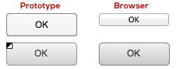
On the opposite, Button Shape is a custom widget that provide us with more options and control over its behavior. It’s possible to use custom colors and shapes, as well as OnMouseEnter and OnMouseOut actions.
| Button | Button Shape | |
|---|---|---|
| Shape | OS standard | Customizable |
| Height | OS standard | Customizable |
| Button Color | OS standard | Customizable |
| Font Style | Customizable | Customizable |
| Rollover Style | OS standard | Customizable |
| Mouse Down Style | OS standard | Customizable |
| Selected Style | OS standard | Customizable |
| Disabled Style | OS standard | Customizable |
| ToolTip | Available | Available |
| OnClick Action | Yes | Yes |
| OnMouseEnter Action | Depends on OS | Customizable |
| OnMouseOut Action | Depends on OS | Customizable |
So, use Button if you need it to look “system” and Button Shape (or Rectangle) if you need control and customization. Be sure to test you Button look in different OS browsers as its look will vary.
Custom button with icon
There’s one issue you can come across dealing with a button: you can’t insert an icon into it. While you can just place an icon over your button, it will mean two options you’ll loose with – your button loses its rollover style while mouse cursor is over the icon, and it’s not clickable.
While you can set OnClick action for your icon laying over the button the same as the button action itself, you will not find a Rollover state among “Set Widget(s) to Selected State” actions. Well, there’s a little trick you can use to eliminate that and make your custom icon-labeled button fully functional. Note: use this trick only if you don’t need to have a separate selected button state (ex. by pressing a button user will be transferred to a different page or screen).
As we have only two given button states (Default and Selected) we can use the latest one to mimic the rollover button state while the mouse is over an icon. To set that we need to add OnMouseEnter case for our button icon, choose Set Widget(s) to Selected State and set the button’s value as Selected. In order not to stick with the selected state after your mouse runs over the icon, add the opposite (set button’s value as Default) OnMouseOut. Now, open Edit Button Shape right-click menu and set the same style for both Rollover Style and Selected Style. That’s it – you have a custom button with an icon embedded with a natural rollover & click behavior for both icon and button itself. Note, there is a way to make it quicker: instead of setting actions for button and icon, you can set those actions to an Image Map Region and place it over your button and icon altogether. Acting that way you’ll avoid setting OnClick actions for button and icon and setting OnMouseOver/Out settings for your icon, but it will add one more layer object to your prototype and you will not be able to set MouseDown Style.
Now, when you’re done with a nice custom button, one more dirty trick: if you spent some time designing our compound UI element, have set all its actions and need another one with a similar look and behavior, don’t hesitate to copy it. You will find that your button+icon+image map region copy will work as a separate instance. However, remember that we do follow best practices so, please, set an appropriate name for your new widget.