Pocket (formally Read It Later) – is a great app for those who use to jump through everyday sources of information to screen out irrelevant, read important and mark others to read it later. With a new UI and iOS integration, it’s a must-have for techie iOS+Mac users. While using Safari plugin for a while I would like to offer some UX improvements there.

Suggested UX Improvements for Pocket’s Safari Plugin
- Visual Feedback on Save: Right after adding a page to Pocket, change the plugin icon color (e.g., to red for 1 second) to provide immediate feedback. Users shouldn’t have to click twice to confirm a successful save.
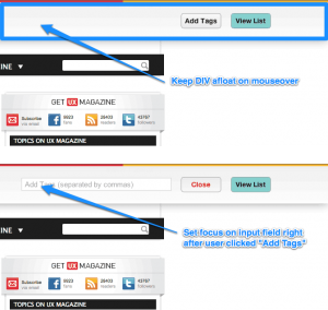
- Persistent Pocket DIV: When the user clicks the Pocket icon and the Pocket DIV appears from the top, keep it visible until MouseOut rather than hiding it prematurely.
- Auto-Focus on Tag Input: When the user clicks Add Tags, automatically set focus on the input field instead of requiring an extra click.
None of this is rocket science, but small improvements like these could make the Pocket plugin even better.