Buttons are an essential part of any interface. While there are some exotic button-less UIs, in most cases, users instinctively look for “the button.” In this post, I’ll share some button tips & tricks for prototyping in Axure RP.
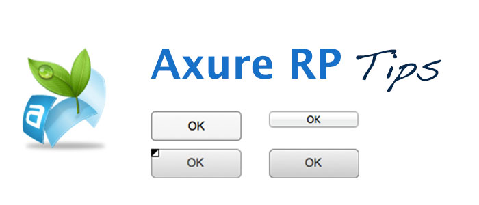
Two Types of Buttons in Axure RP
Axure RP provides three key widgets related to buttons: Rectangle, Button Shape, and Button.
Note: Rectangle and Button Shape are identical in terms of options and behavior. The only difference is that in the widget list, Button Shape appears as “Unlabeled (Button Shape)” or “Unlabeled (Image).” If you follow best practices, you probably always name your widgets properly. But for those who don’t, here’s a small hack: use Button Shape if you’re feeling lazy and want a quick solution.
Button Shape vs. Button
The Button widget relies on your OS UI to render its appearance and behavior. This means it follows:
- System-standard height
- System-standard style
- System-standard interactions (e.g., mouse-over effects, click behavior)
This makes it a useful choice when designing prototypes that closely mimic native system elements.
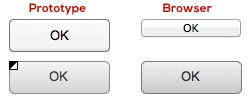
On the other hand, Button Shape is a custom widget that provides greater flexibility and control. It allows for:
- Custom colors and shapes
- OnMouseEnter and OnMouseOut actions
This makes Button Shape a better choice when you need full design customization beyond the standard system styles.
| Button | Button Shape | |
|---|---|---|
| Shape | OS standard | Customizable |
| Height | OS standard | Customizable |
| Button Color | OS standard | Customizable |
| Font Style | Customizable | Customizable |
| Rollover Style | OS standard | Customizable |
| Mouse Down Style | OS standard | Customizable |
| Selected Style | OS standard | Customizable |
| Disabled Style | OS standard | Customizable |
| ToolTip | Available | Available |
| OnClick Action | Yes | Yes |
| OnMouseEnter Action | Depends on OS | Customizable |
| OnMouseOut Action | Depends on OS | Customizable |
So, use Button if you need a native system appearance, and use Button Shape (or Rectangle) if you need control and customization. Be sure to test your button’s appearance across different OS browsers, as it may vary.
Custom Button with Icon
A common issue with buttons is that you can’t insert an icon directly into a Button widget. While you can place an icon over the button, this causes two problems:
- The button loses its rollover style when the mouse hovers over the icon.
- The icon is not clickable as part of the button.
You can manually set an OnClick action for the icon to match the button’s action, but you won’t find a Rollover state in the “Set Widget(s) to Selected State” actions. Here’s a simple trick to make your custom icon-labeled button fully functional (note: only use this if you don’t need a separate selected button state, e.g., when pressing the button navigates to a different page or screen).
Trick: Using the Selected State as Rollover
Since Axure provides only two built-in button states—Default and Selected—you can use the Selected state to mimic a Rollover effect when the mouse hovers over an icon.
- Add an OnMouseEnter case for your button icon.
- Select Set Widget(s) to Selected State and set the button’s value to Selected.
- To prevent the button from remaining selected after hover, add an OnMouseOut case that resets the button’s value to Default.
- Open the Edit Button Shape right-click menu and apply the same style for both Rollover Style and Selected Style.
That’s it! You now have a custom button with an embedded icon that behaves naturally with both rollover and click interactions.
Faster Alternative: Using an Image Map Region
To speed things up, instead of setting actions for both the button and the icon separately, you can:
- Add an Image Map Region over your button and icon.
- Assign all OnClick and OnMouseOver/Out actions to this Image Map Region.
This method avoids setting multiple OnClick and OnMouseOver/Out actions, but it adds another layer to your prototype and doesn’t allow setting a MouseDown Style.
Copying and Reusing Your Custom Button
Once you’ve designed a compound UI element (button + icon + image map region) and set all its actions, don’t hesitate to copy it if you need another button with the same behavior. The copy will work as a separate instance. Just remember to follow best practices and rename your new widget appropriately.