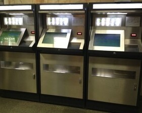
The Kyiv Metro administration has introduced new token vending machines at some stations. While these machines are intended to make purchasing tokens faster and more convenient, I’ve observed that most passengers continue to stand in line at traditional ticket booths, buying tokens from a human operator, while the machines remain largely unused.
What’s wrong with them?
The token vending machine frustration
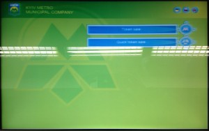
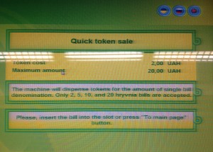
The machine greets passengers with two options: ‘Token Sale’ and ‘Quick Token Sale.’ But what’s the difference? Which one should you choose? No explanation is provided.
The interface itself adds to the confusion. At first glance, nothing on the screen looks interactive—there are no clear button-like elements. I’ve observed people walking away without selecting anything. By tapping the screen, I discovered that a simple text-filled rectangle functions as a button.
Both ‘Quick Token Sale’ and ‘Token Sale’ lead to nearly identical screens, offering no clear distinction between the two options.
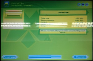
Attempting to insert a 1 UAH bill resulted in repeated failures with no explanation—the machine simply returned each bill. Even after using a change machine, every 1 UAH bill was still rejected.
The on-screen bill acceptor doesn’t resemble the actual hardware. If the intent was to make it skeuomorphic, why is it positioned on the opposite side?
The progress bar at the bottom of the screen functions as a timer. At the top, icons allow switching between three languages, but switching to English prevents switching back to Ukrainian or Russian. While this isn’t an issue for me, it could be problematic for non-English speakers.
As for the icons—consider the screen size. Why not use clearly labeled full-size buttons instead?
I could go into further detail about the many other issues I encountered while trying to buy a token, but I’ll spare you the time.
Token vending machine algorithm
Through experimentation, I discovered that the vending machine operates using two different algorithms:
1.Quick Mode – Insert a bill, press a button, and receive tokens and change.
2.Regular Mode – Insert one or multiple bills sequentially, press a button, and receive tokens and change.
Users can switch between these modes:
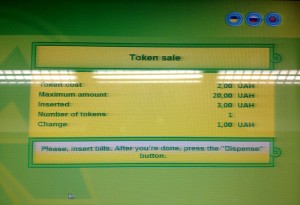
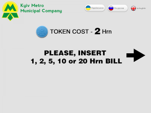
•Quick Mode only accepts denominations of 2, 5, 10, and 20 UAH, as 1 UAH is insufficient for a single token (1 token = 2 UAH). For example, inserting a 5 UAH bill results in 2 tokens and 1 UAH in change.
•Regular Mode allows inserting multiple bills (1, 2, 5, 10, or 20 UAH) before pressing the dispense button.
However, neither mode allows users to select the number of tokens they wish to purchase. There is no option to insert a 20 UAH bill and receive a custom number of tokens—doing so will always result in 10 tokens, regardless of the user’s intent.
Regular mode algorithm
1. User taps “Token Sale”
2. User inserts a bill
3. User chooses one of two options:
- 3.1. User taps “Dispense” to receive tokens & change
- 3.2. User inserts another bill
- 3.2.1. User taps “Dispense” to receive tokens & change
4. Machine dispenses tokens
Quick mode algorithm
1. User taps “Quick Token Sale”
2. User inserts a bill (only one bill allowed)
3. Machine dispenses tokens or tokens & change
The only real difference between the two modes is that in the first case, the machine accepts 1 UAH bills and waits for additional bills, while in the second, it does not.
The reason is simple—token vending machine engineers designed the algorithm purely from a mechanical perspective, focusing on automating token sales without considering human behavior or usability.
Making the world better
Based on the insights gained from experiments, I’ve identified two main scenarios:
1.Buying tokens without change (using 2, 10, or 20 UAH bills).
2.Buying tokens with change (using 1 or 5 UAH bills).
Since there is a 3-to-2 likelihood that a transaction won’t require change, simplifying the algorithm makes sense. This approach not only clarifies the process but also unifies it, eliminating the unnecessary step of selecting a mode.
The updated token vending machine UX design
Buying tokens with a change scenario
1. User inserts a bill.
2. Machine dispenses tokens and offers the option to insert another bill or receive change.
3. User chooses one of two actions:
• Taps ‘Get Change’.
• Inserts another bill.
4. Machine dispenses tokens or a combination of tokens and change.
Buying tokens with no change scenario
1. User inserts a bill
2. Machine dispenses tokens
The updated UX allows users to interact with the machine using just a single tap in the ‘buying with change’ scenario, while the ‘buying without change’ scenario requires no taps at all—users simply insert a bill and receive their tokens.
This streamlined approach reduces complexity and replaces the current cluttered interface with just three clear screen templates.
Here are the screen design sketches:
The welcome screen
The welcome screen displays the token price and the accepted bill denominations (1, 2, 5, 10, and 20 UAH), as higher denominations (50, 100, 200, and 500 UAH) are not supported. This note helps prevent confusion. Additionally, an arrow clearly points to the bill acceptor, guiding users to the correct interaction point.
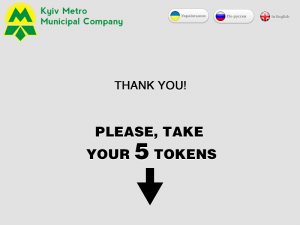
“Thank you” screen
In a no-change scenario, this screen displays the total number of tokens purchased, with an arrow pointing to the tray where they are dispensed.
“Insert another bill or press Get change”
In case of a change scenario.
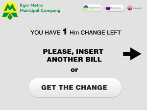
The updated approach does not affect token counting in the case of a change scenario, as the final ‘Thank You’ screen will still display the total number of tokens purchased.
The current algorithm limits token purchases to a maximum of 10 per transaction. However, the updated design removes this restriction by allowing users to insert multiple bills sequentially without restarting the purchase process.
From a user interaction perspective, the new design requires no clicks at all for purchases without change — or just one click in the change scenario.
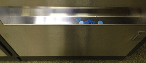
Last but not least, consider the tray — an open compartment where tokens are collected. Retrieving them in one motion can be difficult, as users may need to slide them to the left or right corner to grab them.
Without debating its size — though it’s so large it could easily hold a couple hundred tokens (we’re not in a casino, right?) — why not curve the tray downward in the center? This simple adjustment would allow tokens to naturally slide to the middle, making them much easier to pick up.