UI
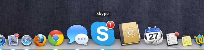
Skype UI updated. Now it’s bad, definitely.
I’ve been a long-time critic of Skype’s UI/UX. Don’t get me wrong, it’s not because I’m Skype hater, it’s cause I’m an active Skype user. Now with Skype v.6 we have been told about some “UI improvements”. What are these “improvements” about?
- Flattened icons
Don’t much different as it wasn’t an issue - Flattened application icon
A trendy move that doesn't improve usability - Facebook +IM integration
Yeah, Skype wants to know more about you - Chatting in multiple windows
That’s nice to have that feature back - Profile-picture picker doesn’t work
Sorry, no thanks for that - Recent images can’t be seen
The same
It seems like we should be grateful for these updates. But, what if Skype UX designers would be really interested in UI improvements? There is a room for that and, believe it or not, it wouldn’t take much effort to make a real improvement. If you wonder, it’s a long-time UI glitch – “offline” and “invisible” status icons. The problem there is that they look the same, while from a user perspective being offline is quite different than being invisible.
Stupid User Interfaces
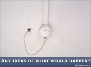 Most of the stuff we use in our everyday life have some kind of interface to manipulate. Some are actually, handy and we do what we need don't even thinking about.
The other... Seems that I'll start collecting those funny things. The picture below is just an example of stupid user interface I've made a shot yesterday. I don't know what the guys were thinking about, BTW it cost me all I knew not to plug it out to see what would happen.
Next time I would probably do.